Create a fantastic, creative, trustrowthy and FUN logo for the Number 1 online marketplace for East Africa

1
Created on 99designs by Vista
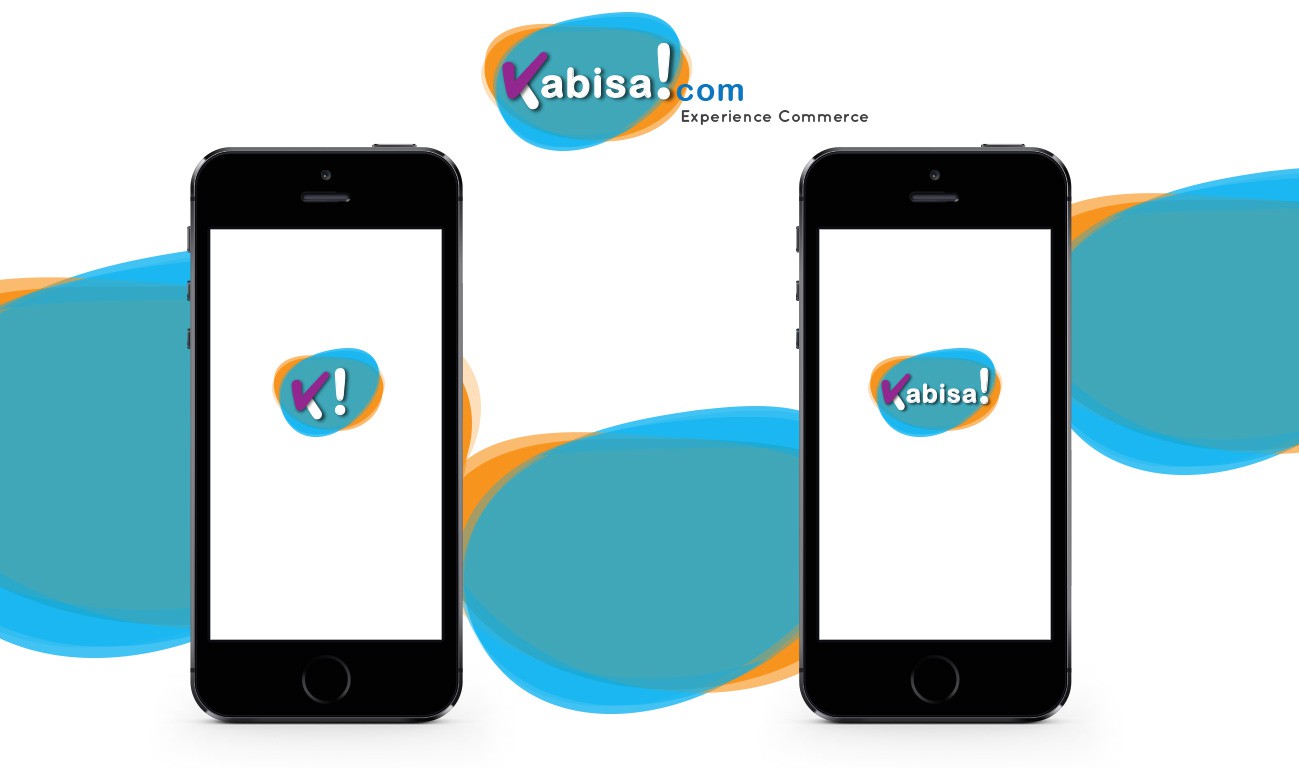
Todays logo trends are all about clever logo and simple and unique. I wanted to incorporate all the elements in the brief that is young, simple, unique and also professional. So I have made this logo that shows the tick mark that shows what the word kabisa means. I have kept it in a different colour from the rest of the text to give it an extra punch. the tick mark forms half of the initial 'K'. I have used the preferred colours that is orange, blue and purple in the logo. Also the uneven circles behind add to the liveliness of the logo and symbolise modernism, young, growing and tech savy.