
Rebranding for a small interior & architectural design brand out of Saint Paul, Minnesota.
The client, Kassina, felt that Hello Norden’s existing logo was in disconnect from the brand’s identity and that it didn’t sufficiently convey brand character.
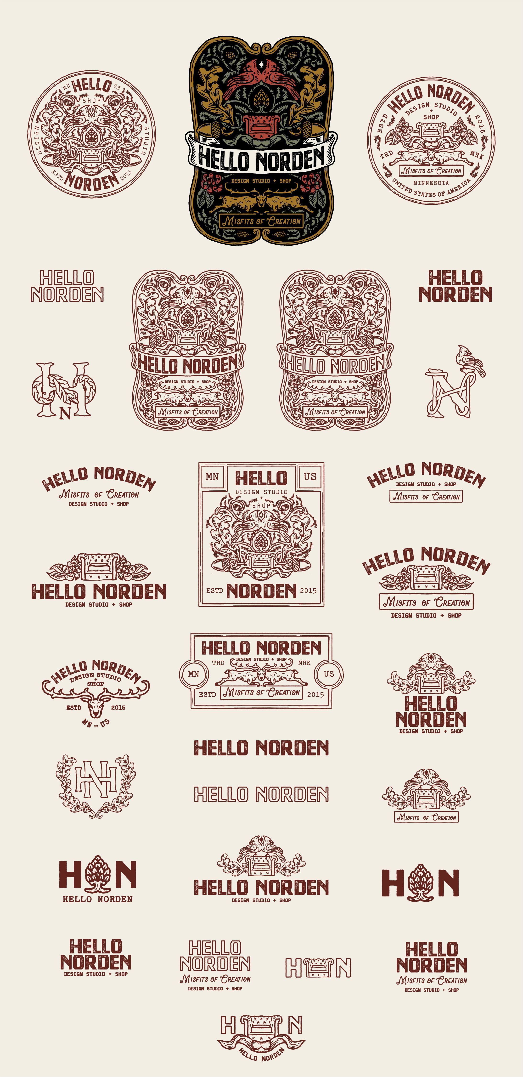
She envisioned a logo that combines Dada, vintage apothecary, and rock & roll influences. The goal was to communicate that HN is an unconventional brand that offers high-quality heirloom goods that are luxurious without pretension.
We created an intricate vintage emblem inspired by Art Nouveau & the Arts and Crafts movement, but with an edgy/biker twist.
The color palette is based around d
dark, but warm and muted fall tones.
For the type, we chose a bold, distressed display font and paired it with a hand-drawn script and a typewriter-style font.