Modern Minimalist logo for Gunnar Bolf

92
Created on 99designs by Vista
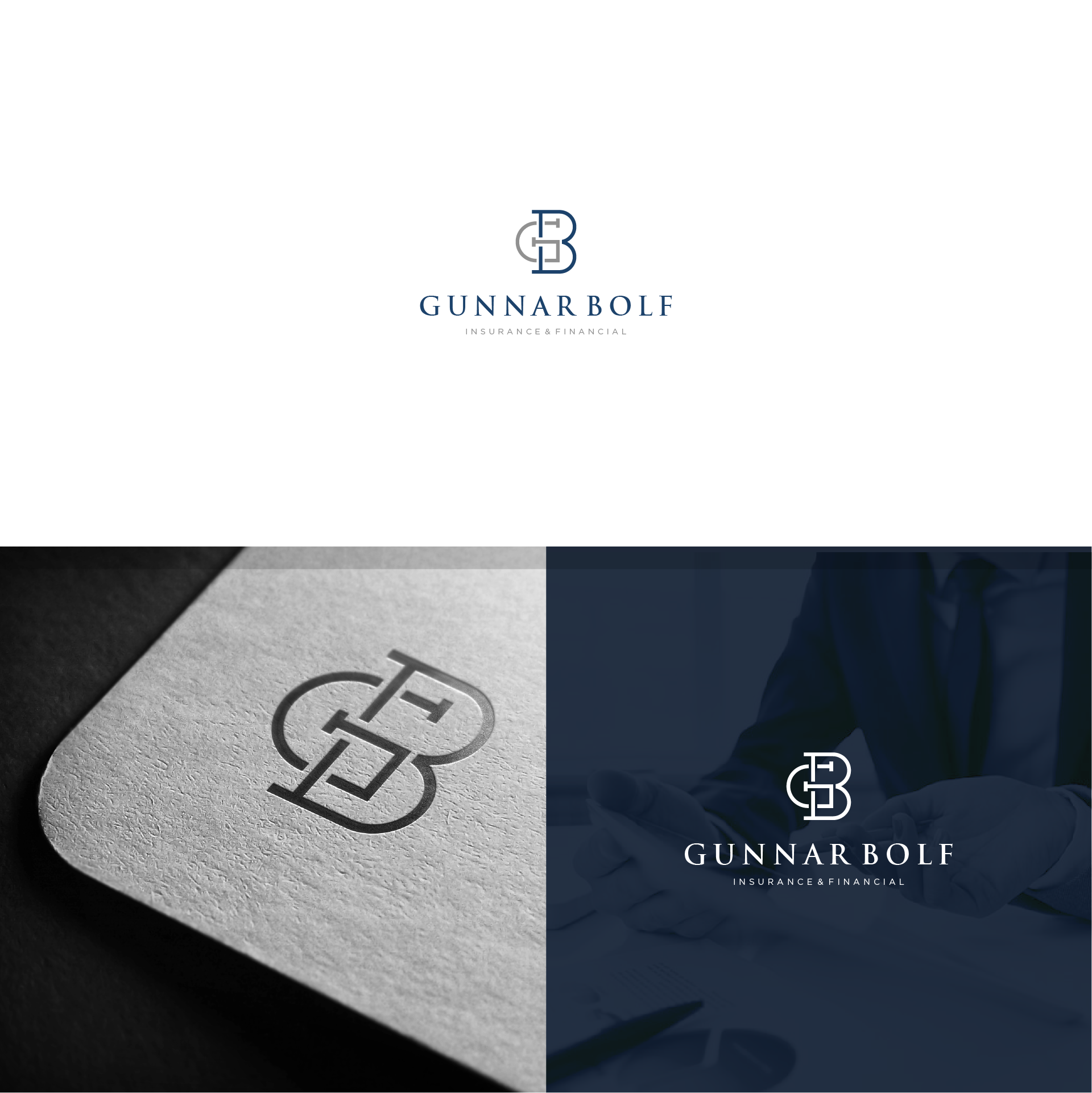
Gunnar Bolf speciality is financial planning and inusrance.
The logo is based on the initials, the two letters are intersected together and shape a solid monogram which evokes insurance, strength... and feels high end and luxury, the color palette is token from the finance industry, silver could stand for money/offices and blue for luxury suits/royality.., the type obviously is a serif backing up the general feel of the logo and going on with the theme of finance.
Check the full project on Behance:
https://www.behance.net/gallery/45110843/Gunnar-Bolf-Identity-design