
Typography is an important part of any good design.
The idea is that the typography can be used separately from the illustrations. Like a seal, like a sign.
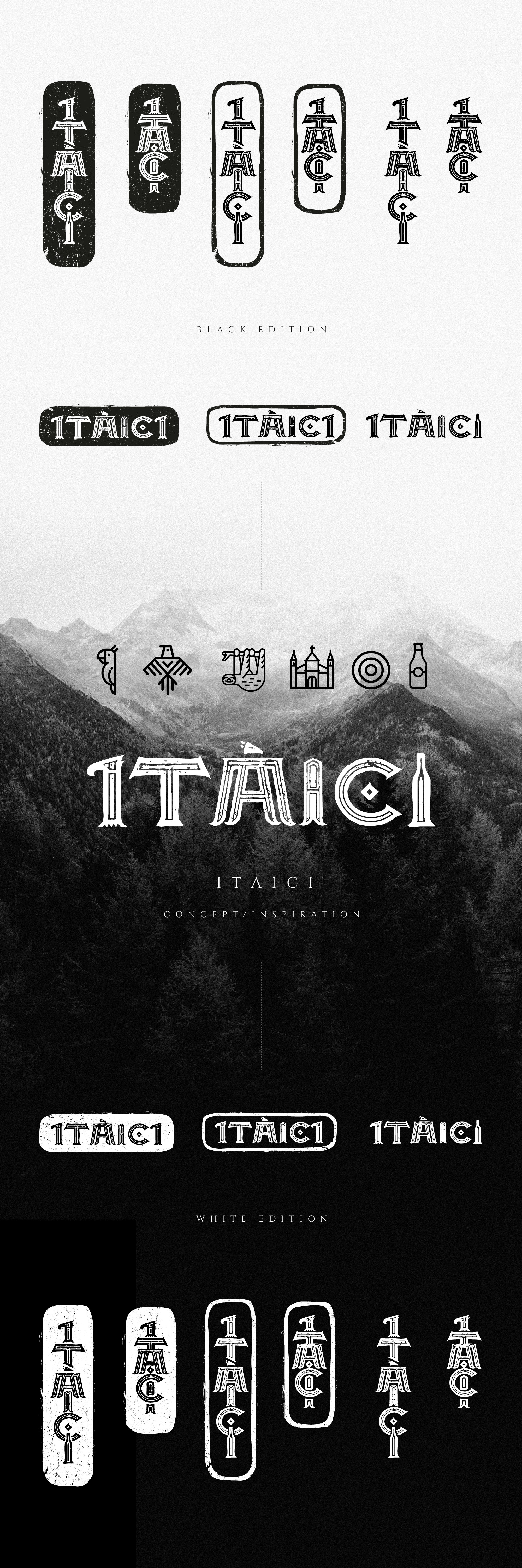
There are two basic versions: A larger name and a monogram. They are all composed of the letters that make up the name ITAICI.
It can be used in horizontal and vertical variations.
The style I designed the letters was inspired by the body art of the local Indians and their writing.
I - represents a bird (toucan, parrot)
T - also a bird with spread wings.
A - is Sloth standing, can be human.
I - the second "I" represents the detail of the monastery, the entrance and the window.
C - is inspired by one of the symbols of the traditional letter from the local population, but also by the target as a symbol of the goal.
I - the third "I" represents a beer bottle.