Fiction novel with two different narratives, from the female and the male point of view.

54
Created on 99designs by Vista
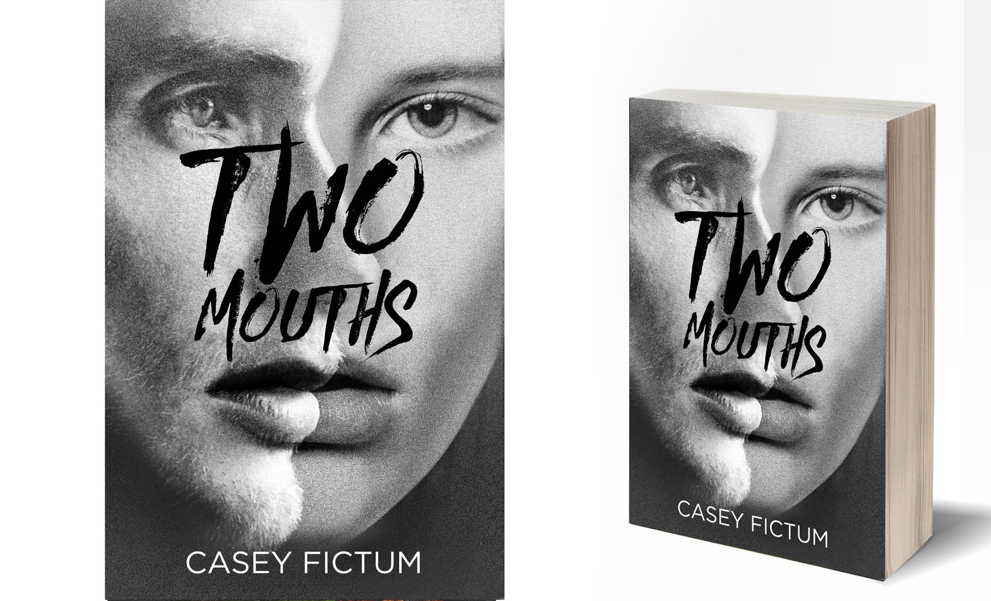
My first thought when i read the brief was to play with the meaning of the title by creating an illusion of two faces merging together into one. The choice of a rough, brush font was meant to add emotional impact to the final layout.