
Created on 99designs by Vista
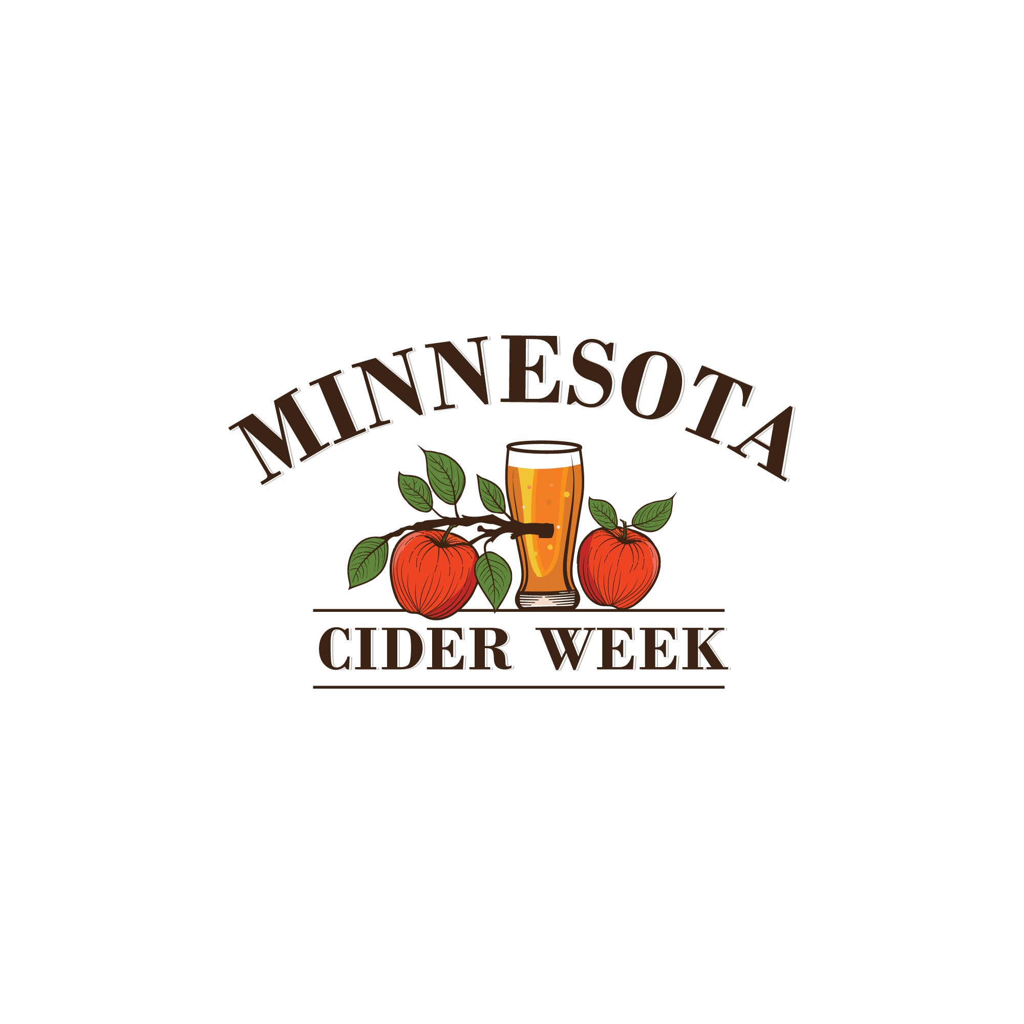
For the Minnesota Cider Week logo, the design features a hand-drawn apple and a cider glass, capturing the artisanal spirit of the event while visually representing the heart of cider-making. The text is arranged in an arc above the illustration, creating a balanced and inviting composition. This approach directly addresses the client's request by incorporating both the apple and cider elements, with the hand-drawn apple adding a rustic, authentic feel that reflects the local craft of Minnesota cideries. The design appeals to the target audience, effectively promoting the celebration with warmth and personality.