UP TEA - The enamel cup design for high caffeine tea Startup

3
Created on 99designs by Vista
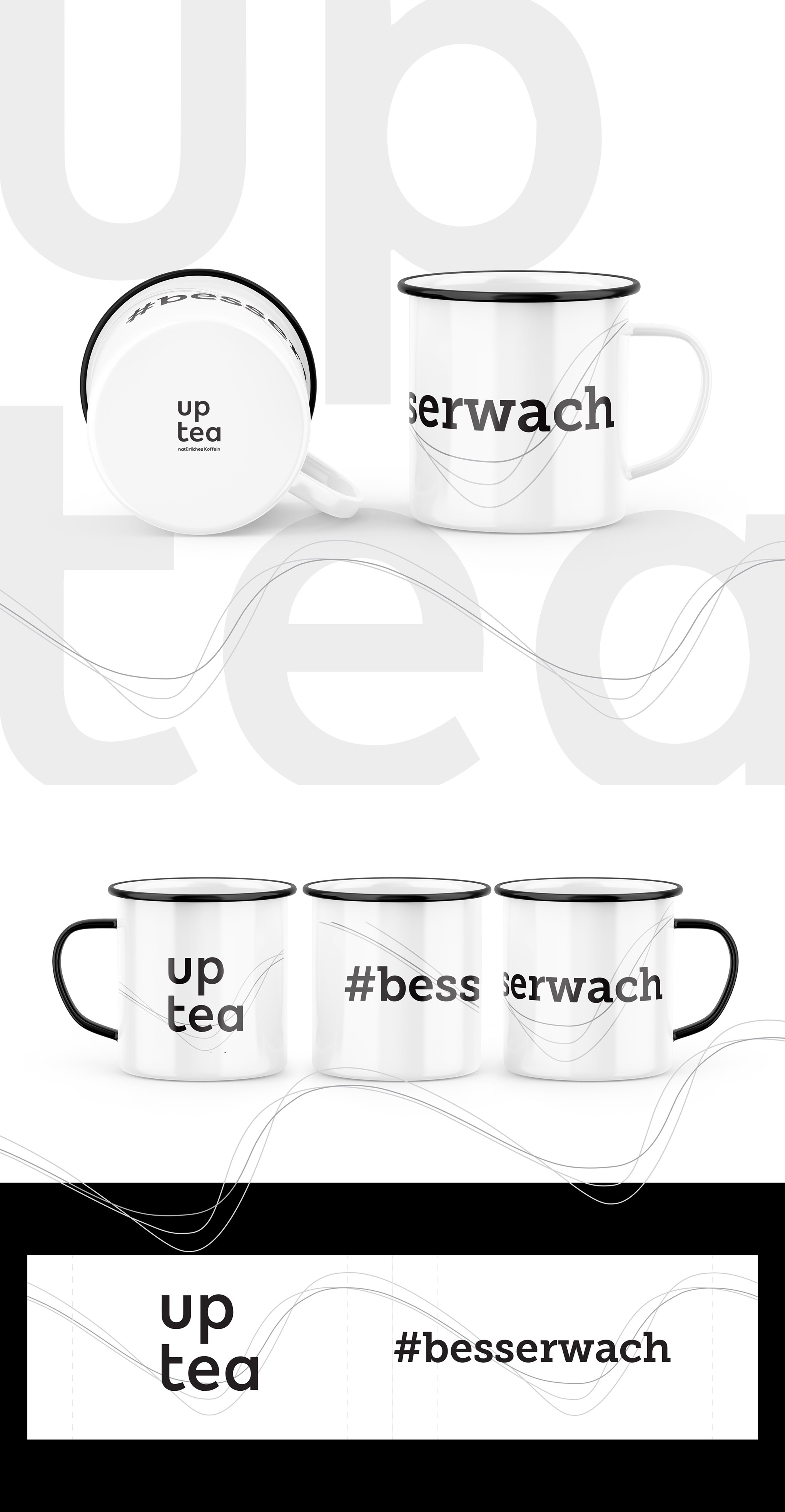
The enamel mug for the Up Tea brand has been designed to reflect the appearance of the brand's packaging. The curve on the package represents the caffeine intake. It was transferred to the enamel mug design. The main elements of the project were to be the logo and the slogan #besserwach. The naturalness of the product was to be included in the design. I was supposed to avoid the resemblance to an energy drink. The design was supposed to be clean, minimalist and similar to the tea packaging designs.