
Created on 99designs by Vista
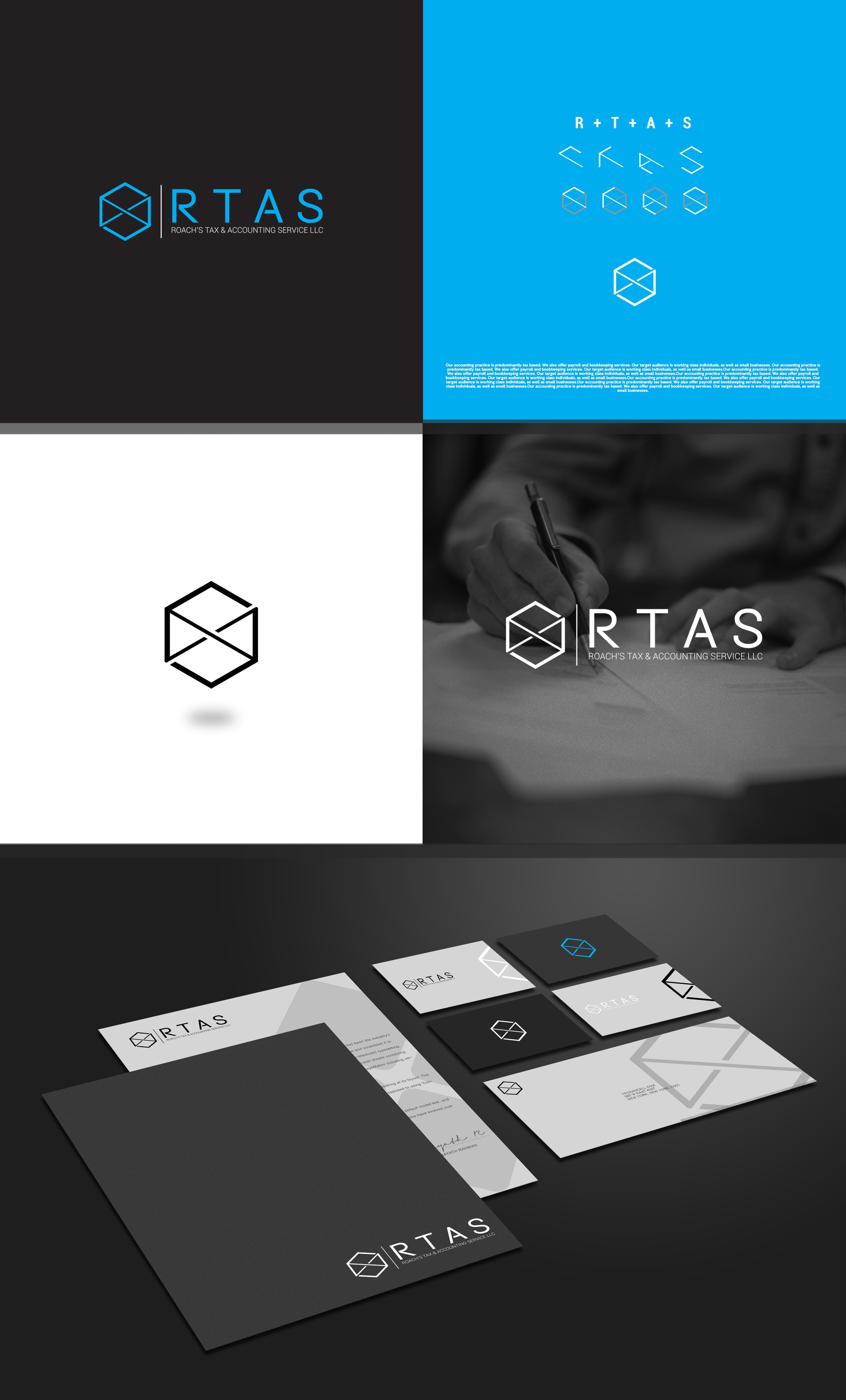
This project required a logo that was clean, simple, and modern, as well as had a meaning that could be related to the business 'RTAS'. I first began by trying to figure out how these letters could go together. I found a way to build them up into a hexagon. The icon itself ended up looking great on stationary, so I wanted to showcase that.