Create a peacefull brand

0
Created on 99designs by Vista
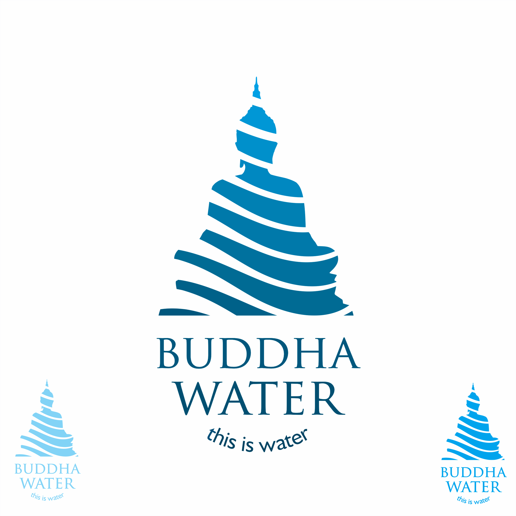
Buddha +water = water in Buddha. I first drew the Buddha outline then filed it with gentle water waves in keeping with the peaceful brand required. The negative space is quite appealing and memorable. I chose a conservative strong font as the client did not want something too modern. I positioned the words in such as way as to suggest a water droplet.
Brand Identity Pack contest entry