Modern label design for vodka bottle

5
Created on 99designs by Vista
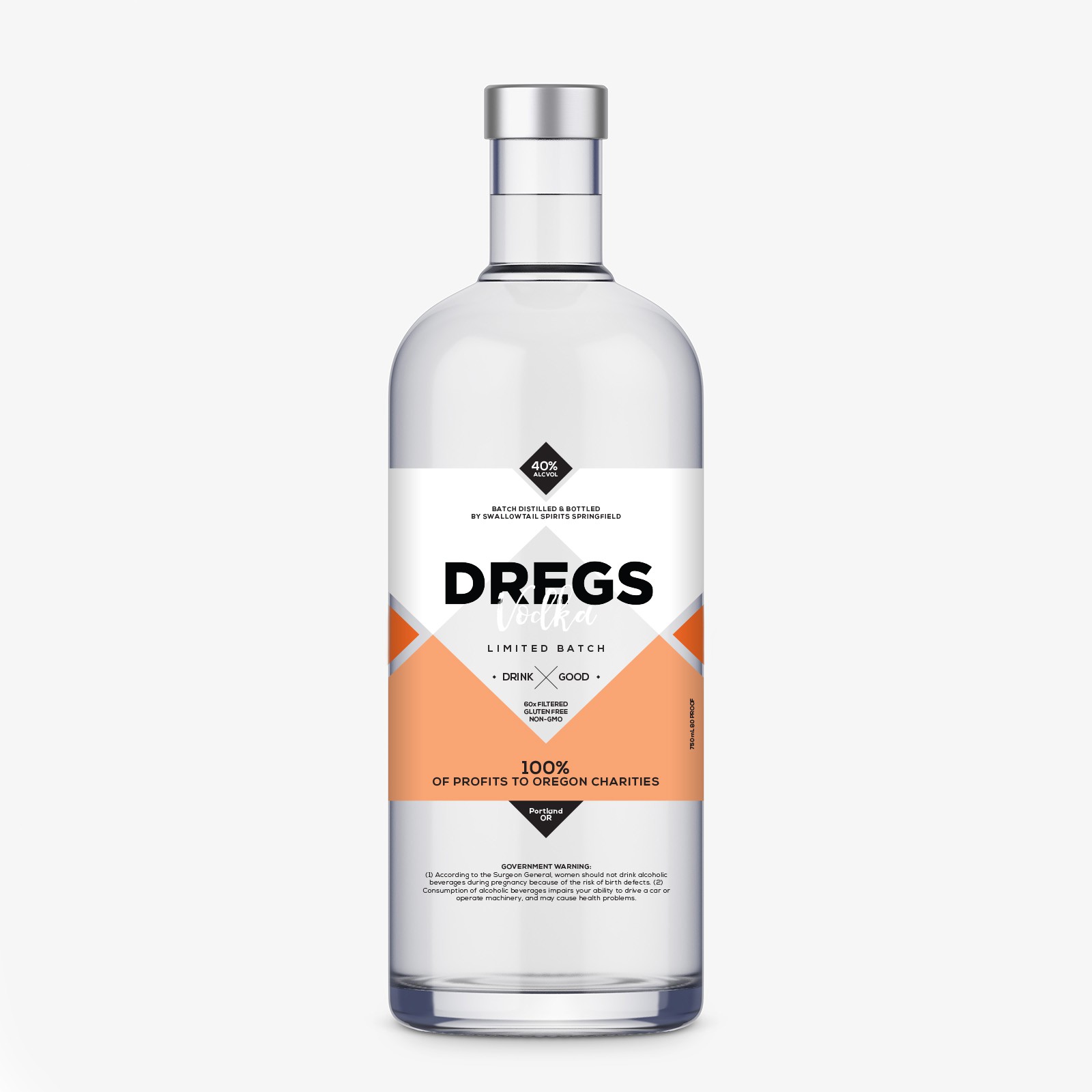
The brand colors play a significant role. The label has a hole in the middle of the shapes so that the vodka can be seen exactly behind the logo and the "drink good" slogan. All the information is placed around the logo and the "window" on the bottle in order to empower the brand significance. The outcome is bold, modern and makes the product stand out among the competition.