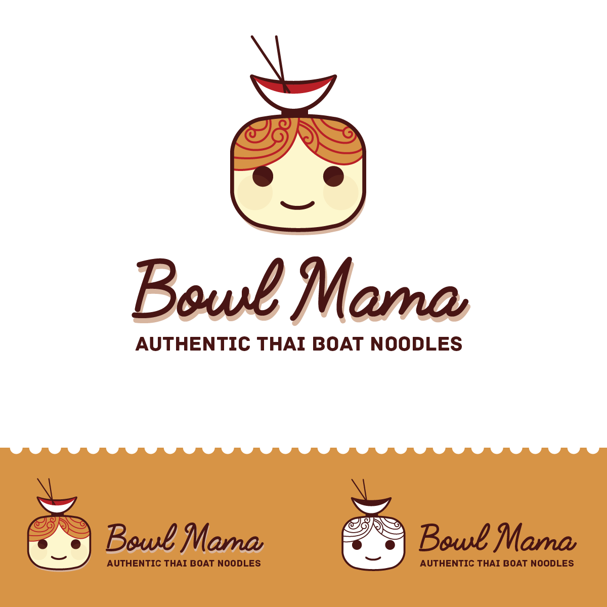

This concept works on the face of a 'chubby mama', with the noodles for the food context. I've made the shapes rounded all through, to give the logo a feeling of organic food, youthful and fun food. Using the face, helps simplify the symbol, while allowing it to be legible in different sizes.
The font for the restaurant name, 'Bowl Mama', is a stringy script font to allude to noodles. The font for the slogan, is a rounded robust font, which helps add to the healthy filling food that the face helps signify.
The colours are a mix pulled from asian food colours, focused on the warm reddish hues that help give a warm, inviting feeling.
The symbol has a bowl placed on top of the head, which also acts as a hair bun. The hair pattern is a wavy pattern, that alludes to the noodles, and hot food.