Label design for an organic juice

2
Created on 99designs by Vista
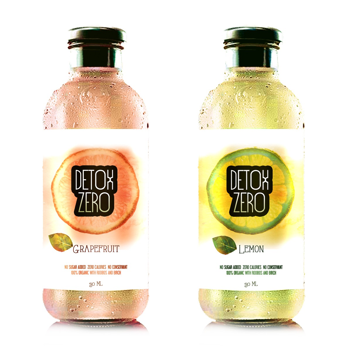
In my designs I tried to follow a modern and fresh line, which is not too busy as to allow for the important elements to stand out. The aquarell background makes it more lighter. The name of the product and the taste is well visible. I put the rooibos and birch to the label as well.
For the name of the product I suggested to be printed in silver colour. The shape of the label is easy to be resized.