RobotLab - Smart and Useful Robots

1
Created on 99designs by Vista
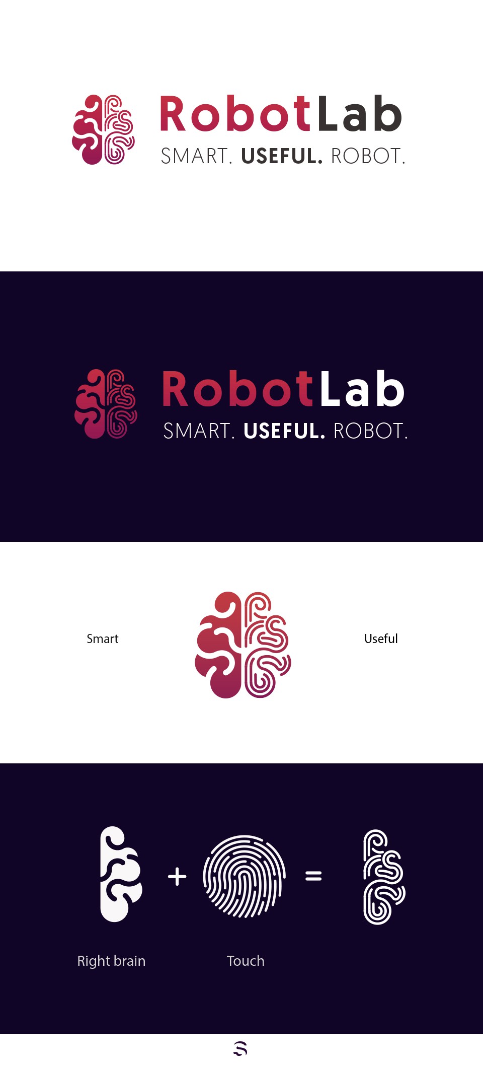
The client wanted an icon to represent the smart and useful aspects of its robots. By splitting the brain into two halves, one side represents the 'smart', and the other one represents the 'useful' by making it seem as a touch-id.