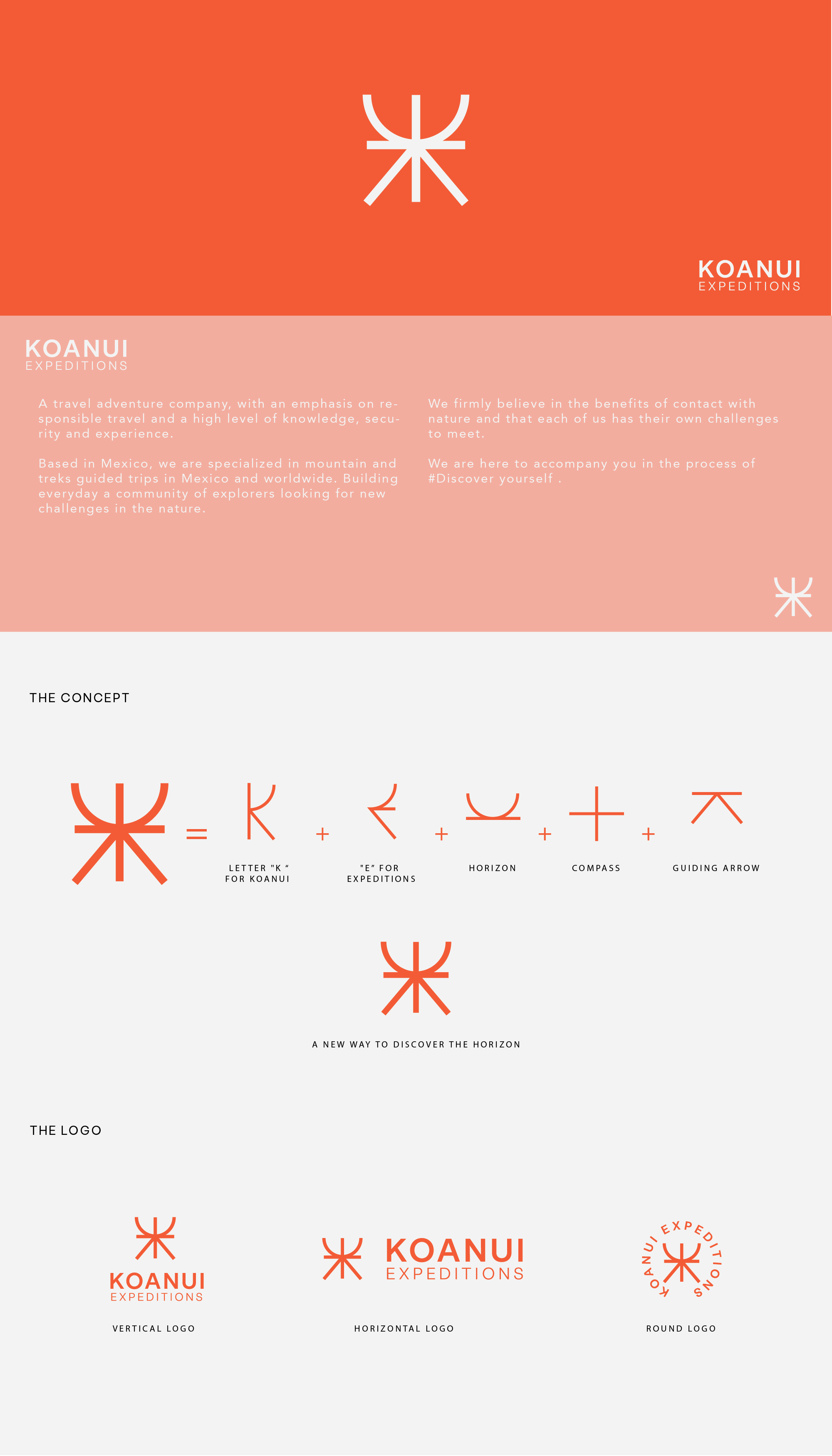
Minimalist complete logo for Expedition co.

2
Created on 99designs by Vista
A Minimalist logo for an expedition company.
The idea of this icon logo was to reflect the exploration/ expedition feeling by merge the letters and some features to give the wanted result. I invite you to discover by your self the real meaning of the logo by looking at the proposal, also this logo contains 3 responsive logos ( vertical , horizontal, and circular, what makes is easier for a future brand development.