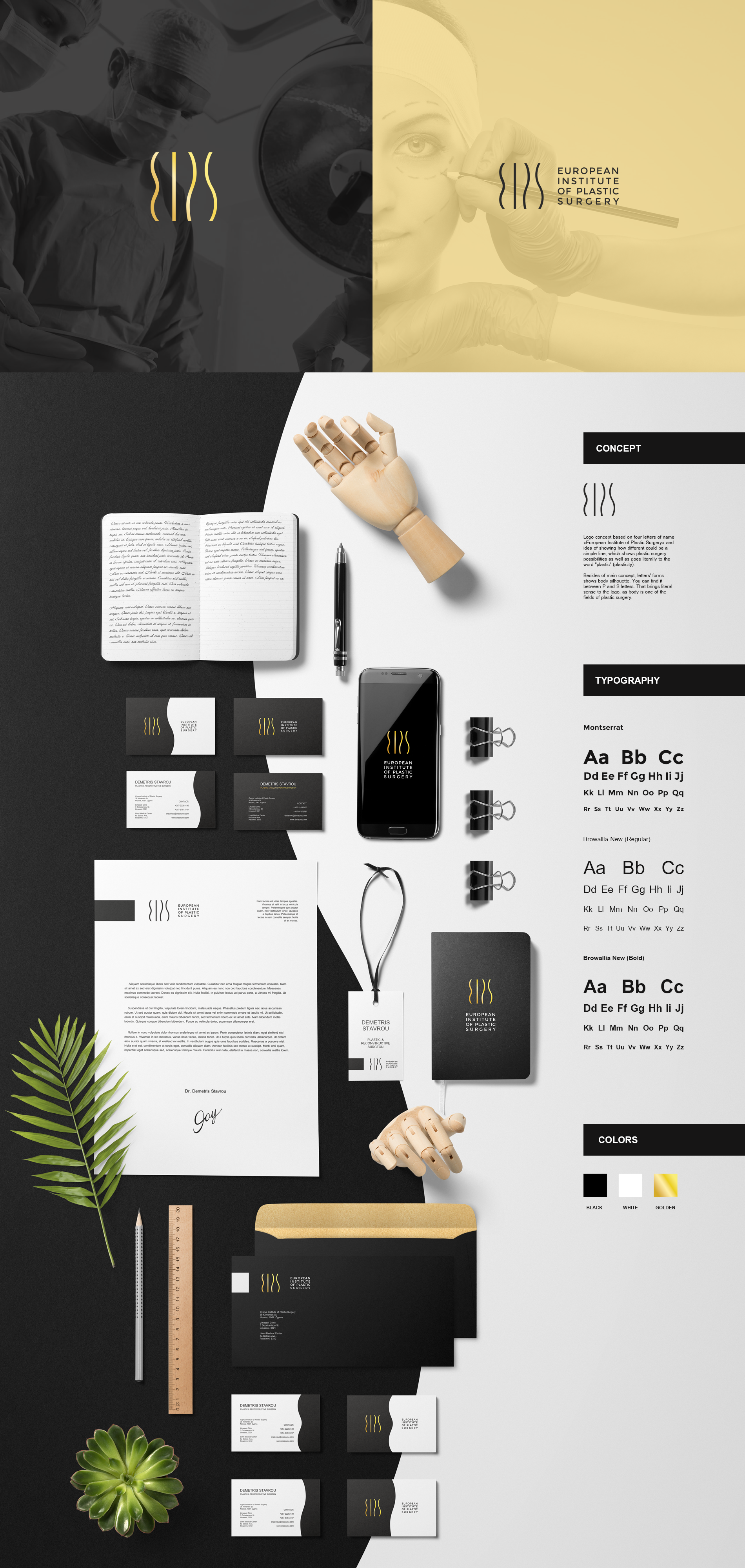
Logo and identity for European Institute of Plastic Surgery

138
Created on 99designs by Vista
Logo concept based on four letters of name «European Institute of Plastic Surgery» and idea of showing how different could be a simple line, which shows plastic surgery possibilities as well as goes literally to the word "plastic" (plasticity).
Besides of main concept, letters' forms shows body silhouette. You can find it between P and S letters. That brings literal sense to the logo, as body is one of the fields of plastic surgery.