Logo concept for craft beer.

32
Created on 99designs by Vista
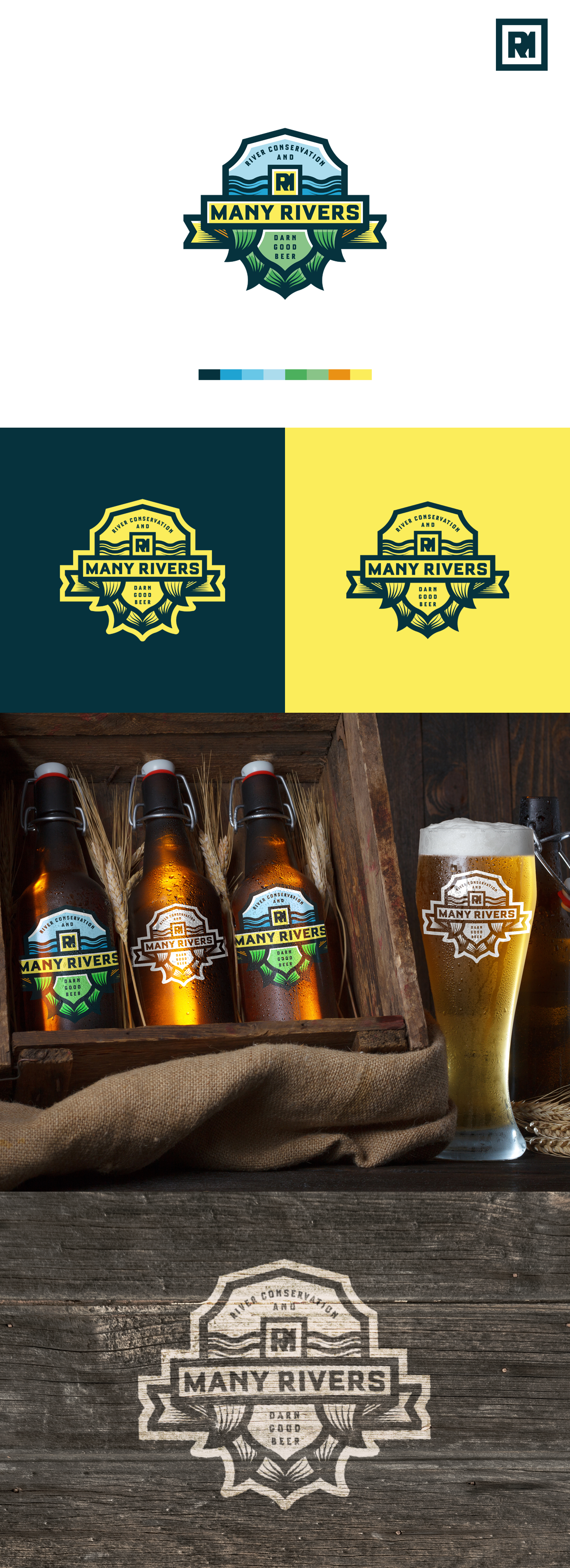
As the main idea we've got shield, wich is changing to hop in the bottom of logo. In the top part of logo we've got waves (to interpret rivers) and monogramm of M and R letters as minimal sign, wich could be used seperatly too (as an icon, for example).
More theme is that we've got river part of the logo with part of slogan "river conservation" and hop on "darn good beer".