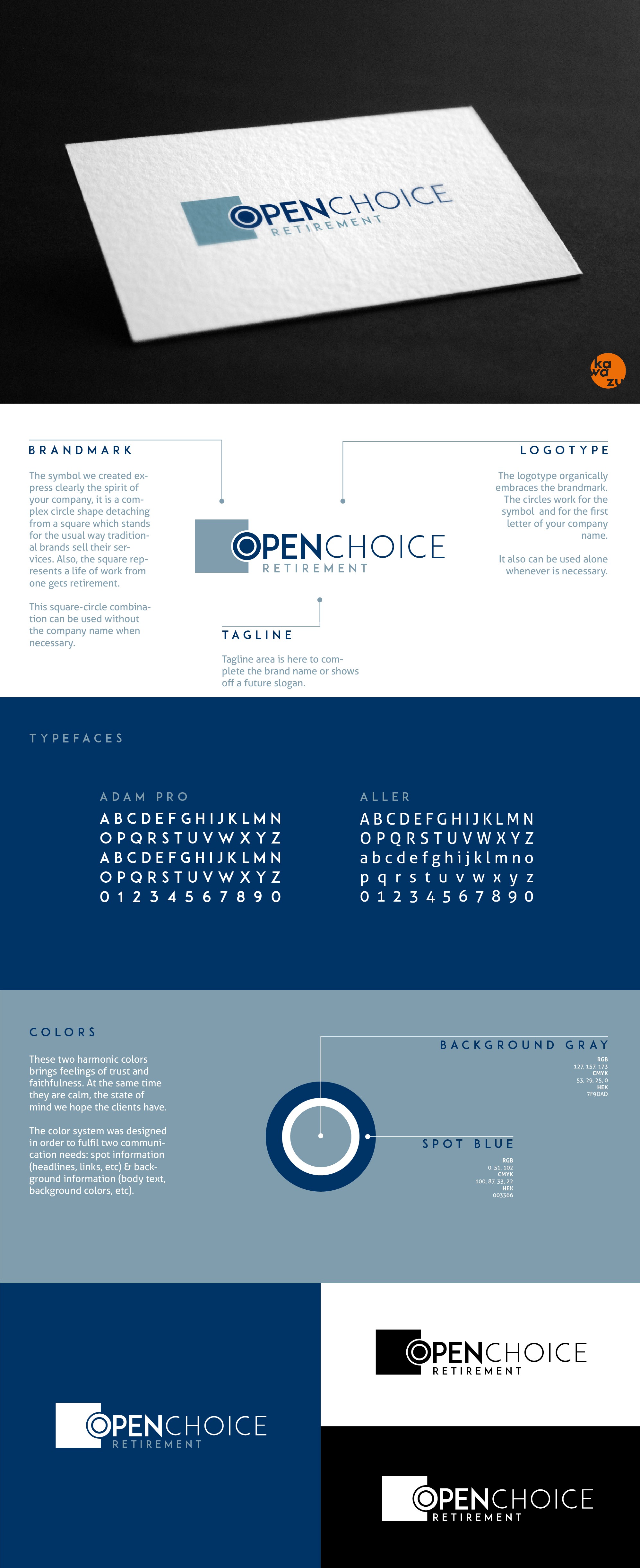

BRANDMARK
The symbol we created express clearly the spirit of your company, it is a complex circle shape detaching from a square which stands for the usual way traditional brands sell their services. Also, the square represents a life of work from one gets retirement.
This square-circle combination can be used without the company name when necessary.
LOGOTYPE
The logotype organically embraces the brandmark. The circles work for the symbol and for the first letter of your company name.
It also can be used alone whenever is necessary.
COLORS
These two harmonic colors brings feelings of trust and faithfulness. At the same time they are calm, the state of mind we hope the clients have.
The color system was designed in order to fulfil two communication needs: spot information (headlines, links, etc) & background information (body text, background colors, etc).