
Created on 99designs by Vista
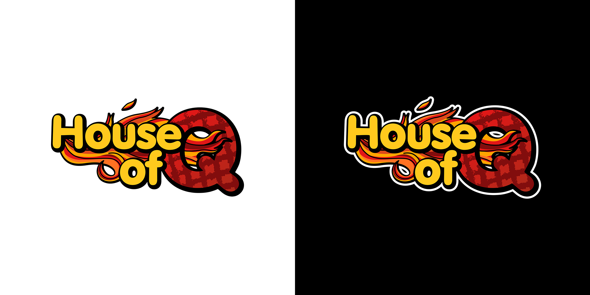
House of Q is a Canadian based company/group that is focused on BBQ sauces & spices and BBQ competition team.
The brief is to redesign the old logo to something new but still have the same feeling of the old logo.
In this logo concept, the Q in the logo is created to looks like a BBQ that is still burned by the flame below it for BBQ related branding & identity purpose, while the usage of rounded font it to give the same feel from the old logo.