
Created on 99designs by Vista
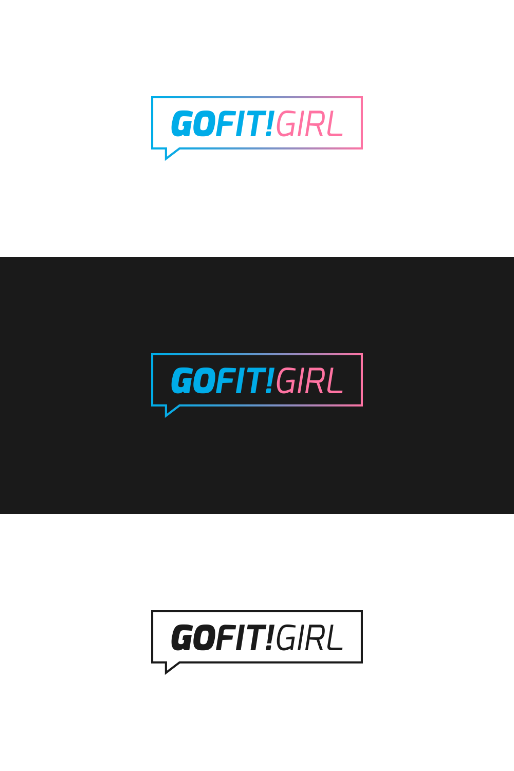
Go Fit! Girl, a website about fitness, sports and a healthy lifestyle was looking for a new logo. This design turns the name "Go Fit! Girl" into a exclamation. The font "Exo" in italic is both feminine and strong and the letters all have nearly the same width. Due to this fact the logo is very balanced and fits great to the company. Another aspect is that the letters also become more slender from left to right and emphasize the goals of "Go Fit! Girl"