
Created on 99designs by Vista
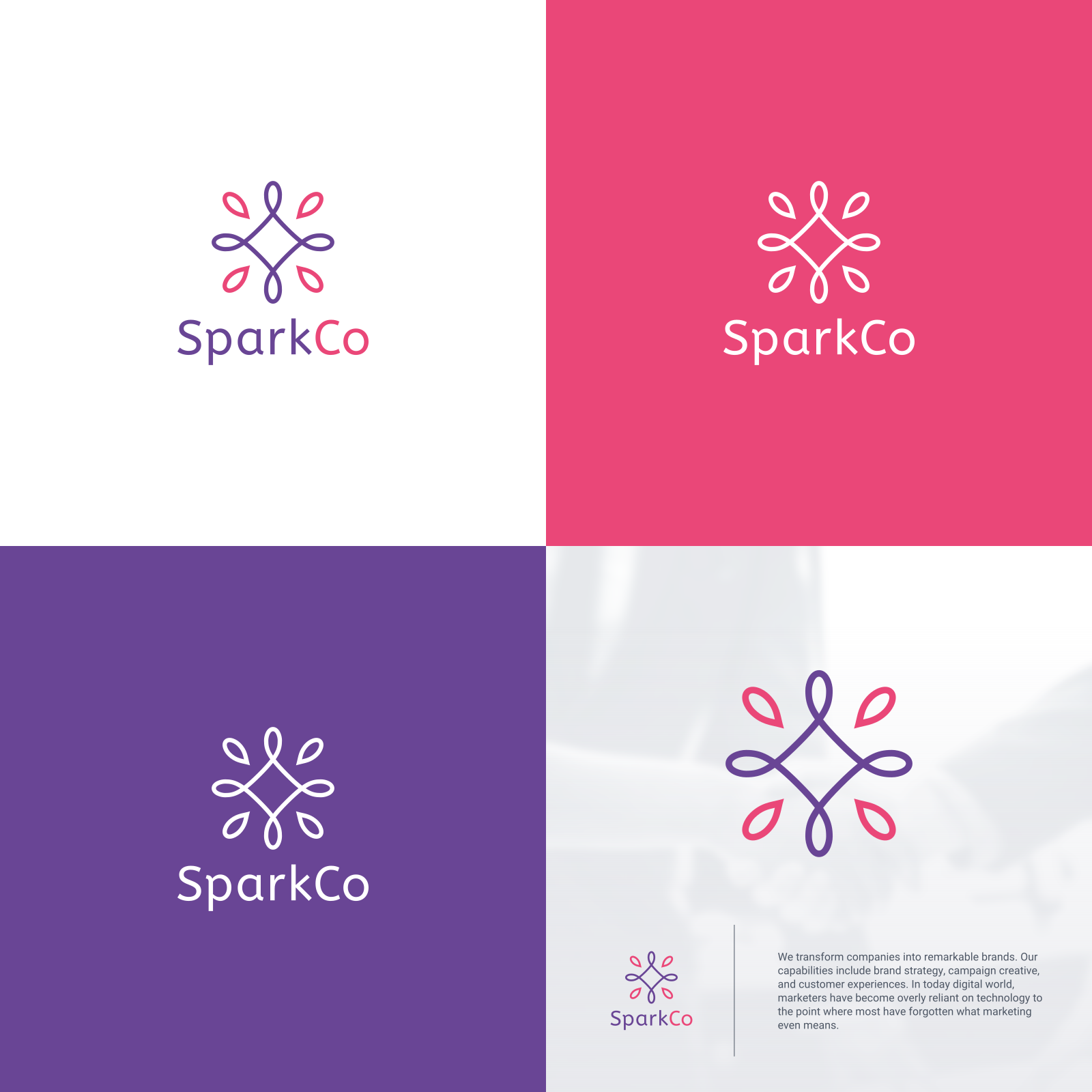
Entry in logo contest for SparkCo, a marketing consultant company. Client wanted to convey the importance of "human connections" in marketing, and at the same time the logo has to reflect the meaning behind the name, i.e. Spark + Co.
I created a symmetrical hand-drawn-like SPARK shape to give the overall feeling of human connections. The inner, continuous line is representing collaboration from the name "CO". While the outer teardrop shapes are representing SPARK of new ideas. Thus, collaborate to spark for new ideas.