
Created on 99designs by Vista
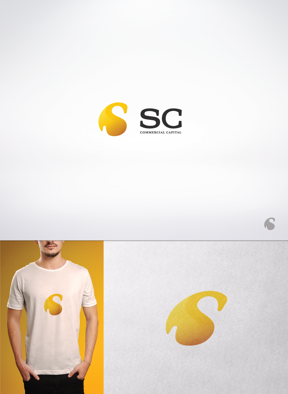
The client wanted a more conservative yet modern looking logo. After a couple iterations we decided upon a simple yet effective icon that stands in for the name of the company and while basic in shape it's stylized in a way which gives it more of a flare. The letter "C" encompasses the "S" while at the same time the latter emerges from the first.