Created on 99designs by Vista
> Logo unused and available for sale <
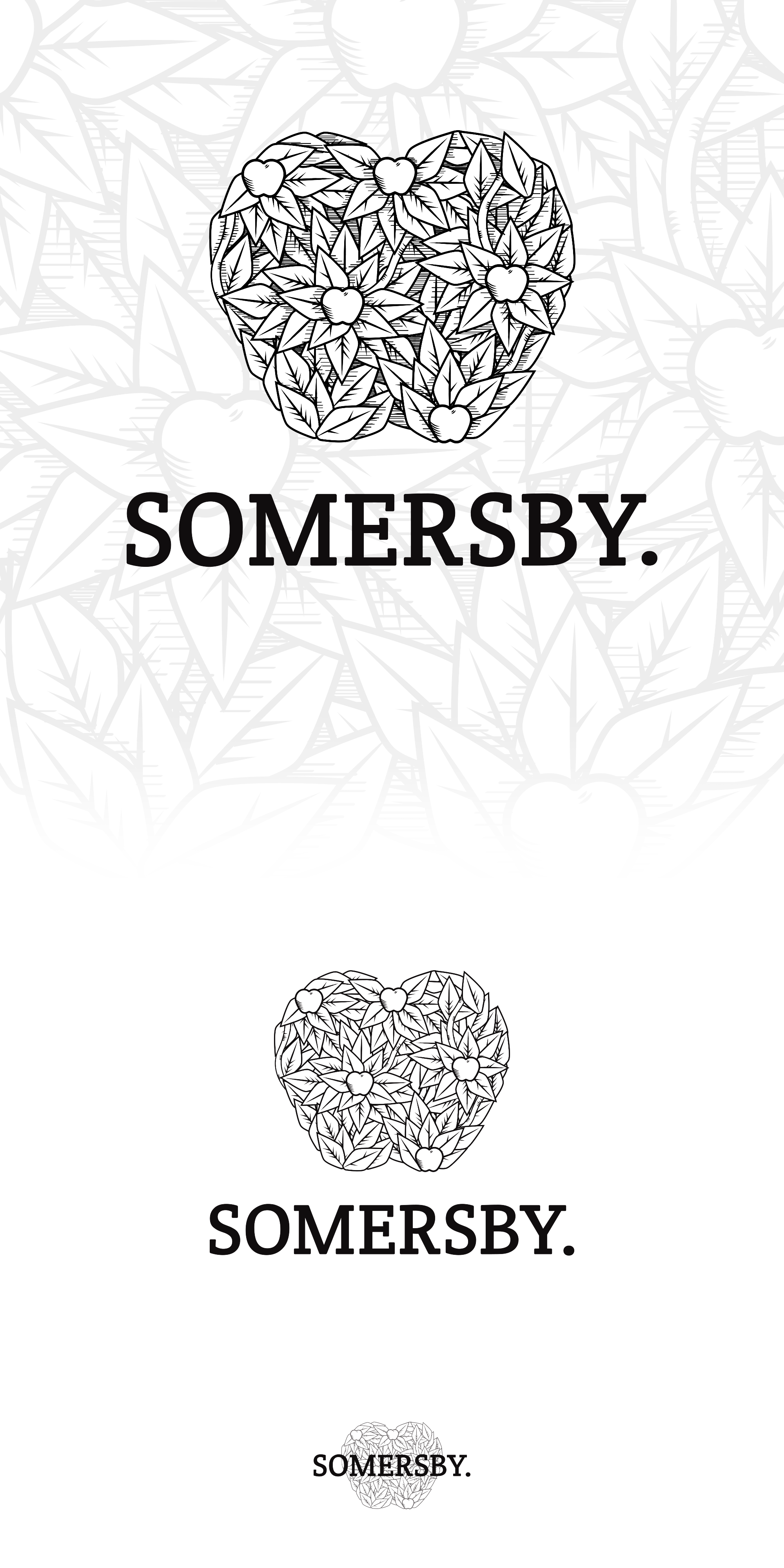
A proposal for the Somersby rebranding. Instead of drawing a tree I wanted to illustrate a complex apple made from leaves, smaller apples, etc.
I wanted something that is no symmetric and mathematically perfect, to give the brand a bit of traditional/heritage and hand made feeling.
I made a version with more small details, shadow lines and another version a bit more cleaner that work better on smaller sizes while it's still seen as the same brand.
** Contact me if you want to see this design with your business name on it **
