
Created on 99designs by Vista
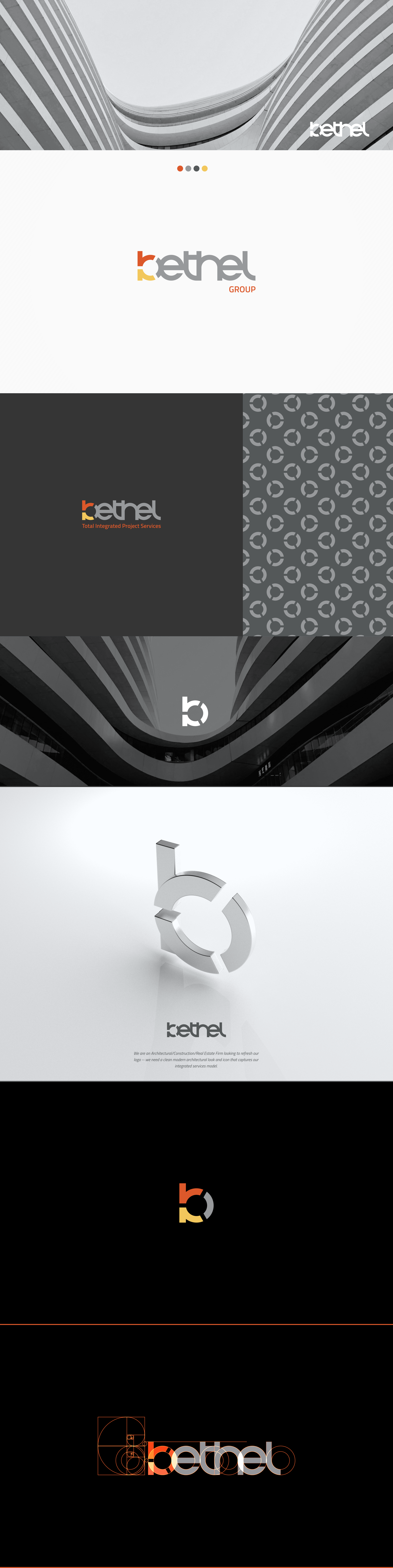
Bespoke wordmark created in golden ratio with integrated brandmark that can be used separately.
Letter "b" is created from three segments representing three integrated services, architecture, construction, and real estate.
The dynamic three-part circle can be used to further accentuate the brand and expand branding capabilities to textures, reliefs, and patterns.
Presented colors continue and reinforce the brand with a rich orange, gray, and off-black color palette.
Partnering typeface is born inside the Accademia di Belle Arti di Urbino as a didactic project Course Type design of the Master of Visual Design Campi Visivi.