
Created on 99designs by Vista
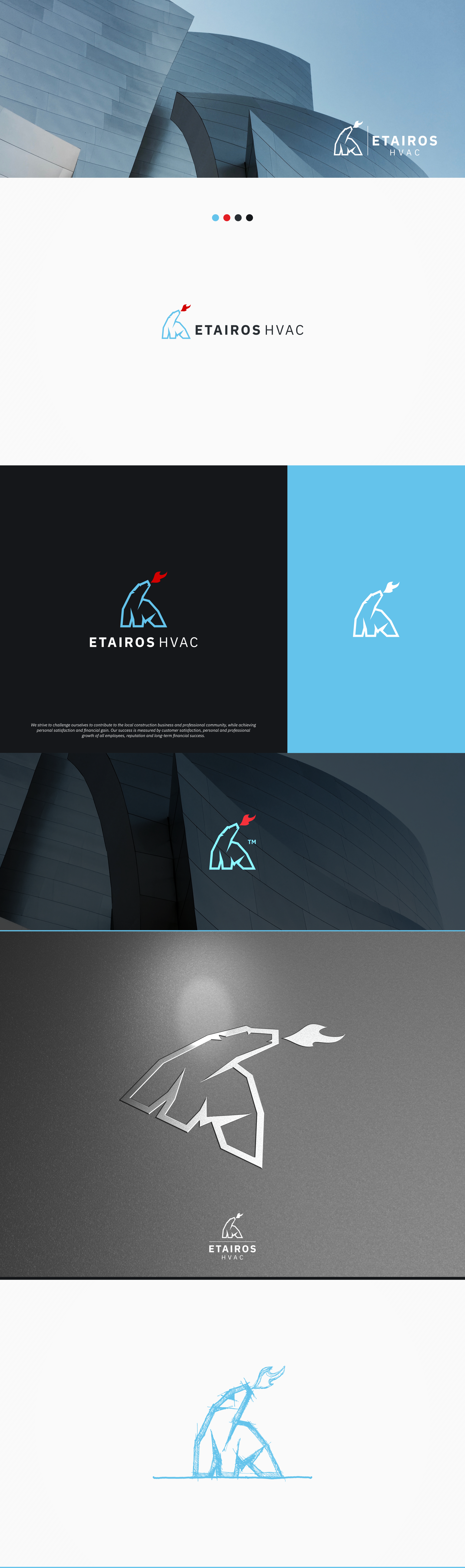
The company owners wanted something that didn't look like every other HVAC equipment sales company. We started with a basic concept of a fire breathing polar bear.
The logo has a professional look & feel.
Bear is constructed from straight lines depicting an ice / cold environment with an agile, noble, trusted posture.
The fire element is constructed with a minimal number of curved lines to accentuate the contrast between hot and cold.
Brandmark is accompanied by a modified neutral, yet friendly Grotesque style typeface that includes a Sans, Sans Condensed, Mono, and Serif and has excellent legibility in print, web, and mobile interfaces.