
Created on 99designs by Vista
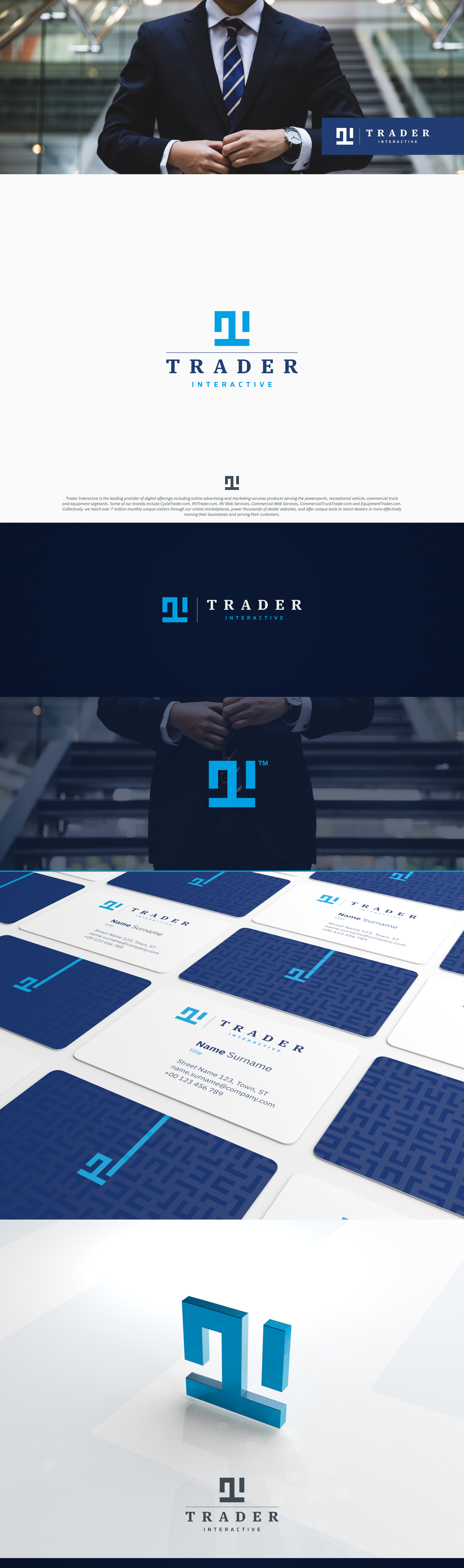
The challenge was to revitalize established brand that did not have a memorable logo.
With 3 proposals to choose from I have decided on a T I monogram, simple, memorable and unique brandmark that captures the brand essence.
Square composition, with a great posture, stable and trustworthy.
In composition with an international typeface family that illustrates the unique relationship between mankind and machine.
Very happy with a great result and a memorable image.