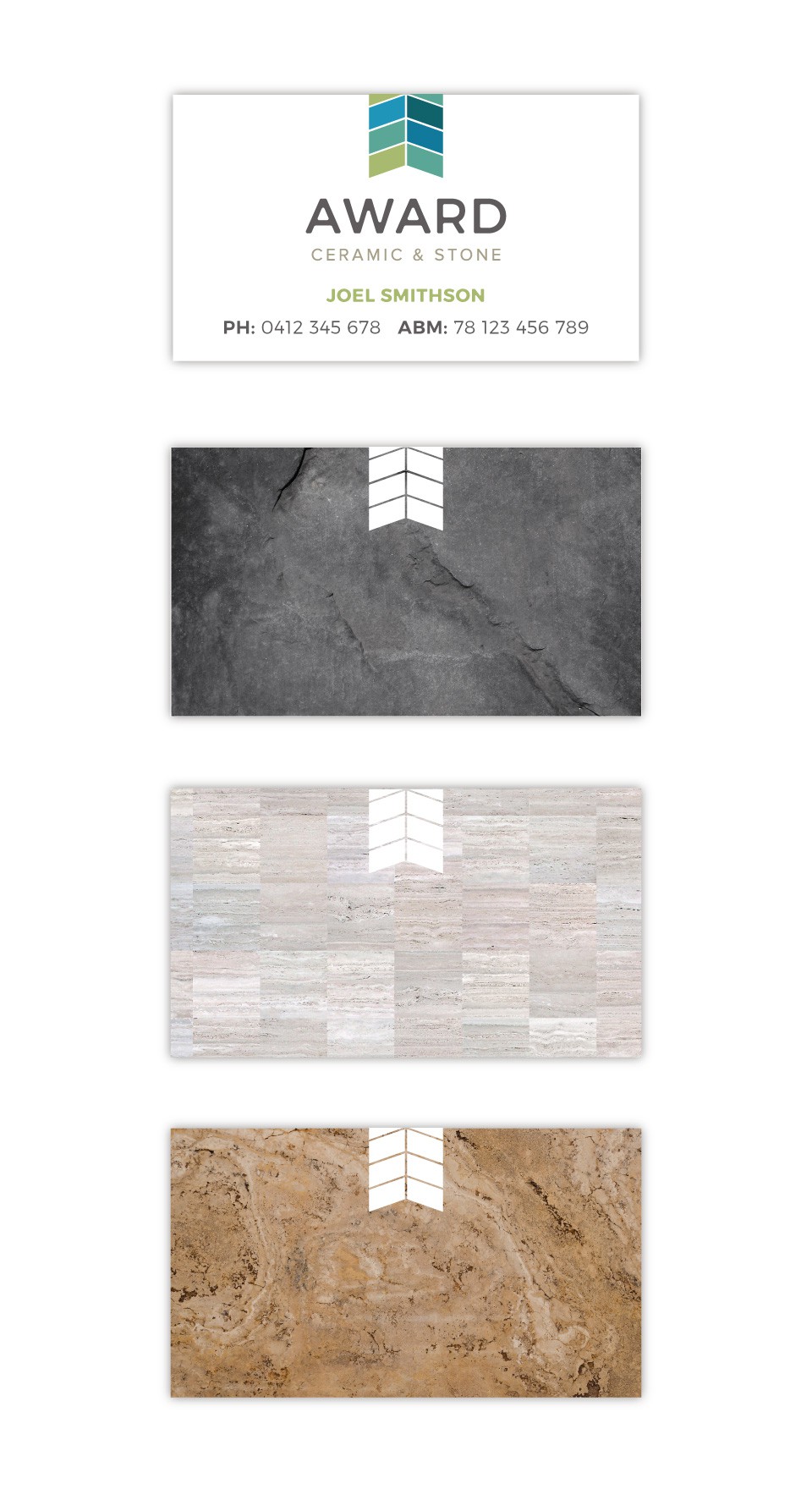
Logo for a Ceramic Tile company

17
Created on 99designs by Vista
The client wanted something 'funky'. The logo mark was inspired by an award ribbon and I arranged tiles in a chevron pattern to create the shape. The back of the card is to showcase the rich textures and patterns of tiles/stones and uses the logo mark to reinforce the brand.