Logo concept for an eco-friendly baby store

1
Created on 99designs by Vista
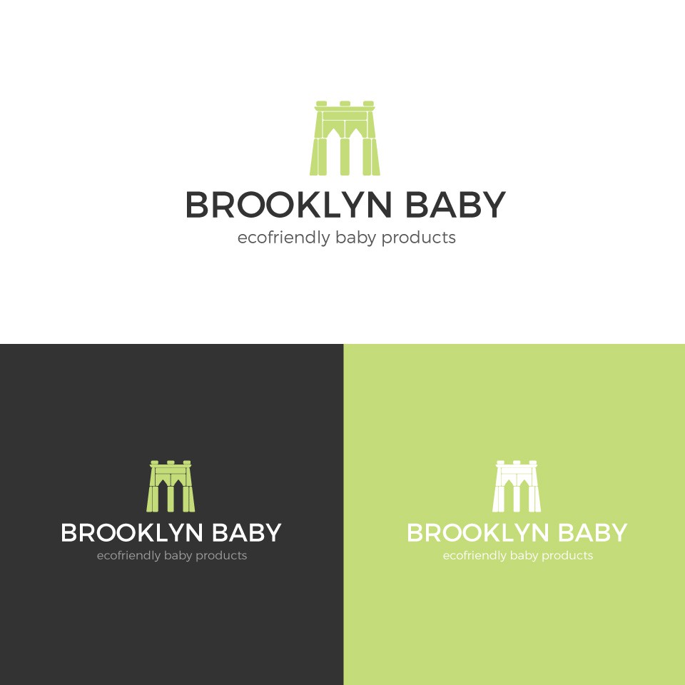
The concept of the logo mark was inspired by the Brooklyn Bridge. I chose to build the iconic symbol out of wooden blocks to tie it in with the baby store theme. The green color speaks to both the eco-friendly aspect and is gender neutral. I chose a sans-serif font in response to the request for a sophisticated, hip and urban feel.