Fun, Energetic Logo for Squad Active

1
Created on 99designs by Vista
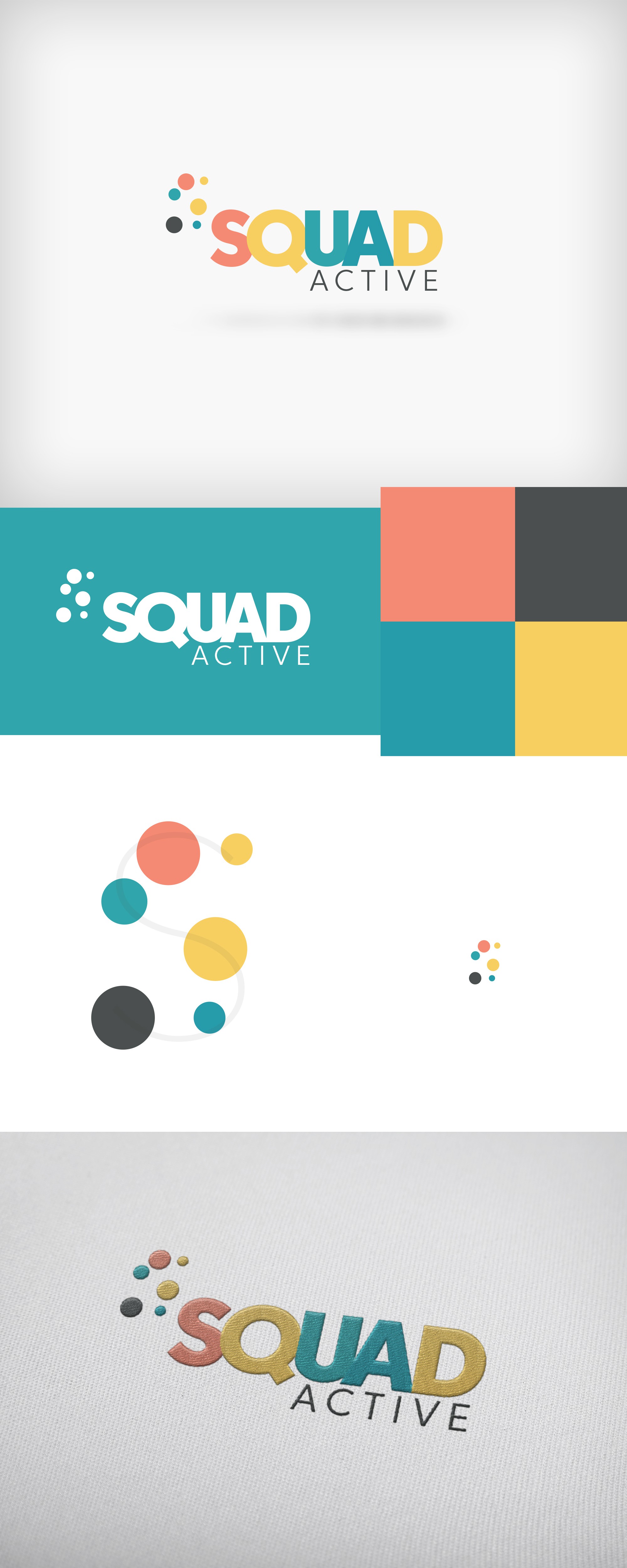
With this project, the client was looking for something that would help their active kids brand be both memorable and exciting. They use the word "squad," and defined it as a "team" or something where there's friends together working towards something. This helped me decide to make the word-mark nice and tight so that each of the letters ran into each other. The dots were then added to allow for this idea that though there are a bunch of people, together they make something even better.
When viewed from a distance, you'll start to see the "S" form from the dots as shown in the design. This allows for the client to use just the logo-mark, however they would like, since it will still be recognizable apart from the "Squad Active" words.