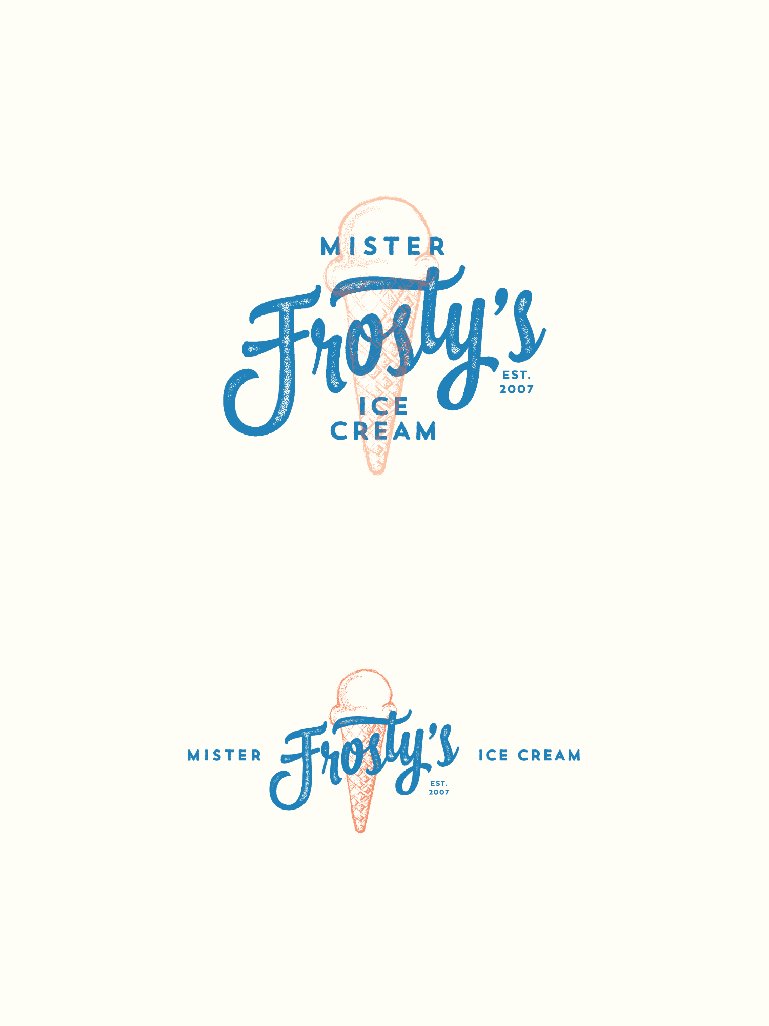
Ice Cream Shop rebranding for 10 year anniversary
426
Created on 99designs by Vista
For the update to this client's logo, I wanted something hipper and more modern than what they had been using for years- something to attract the kids and young parents, and something slightly retro to suggest how long they had been established, while keeping it simple enough to stand the test of time.
