
Created on 99designs by Vista
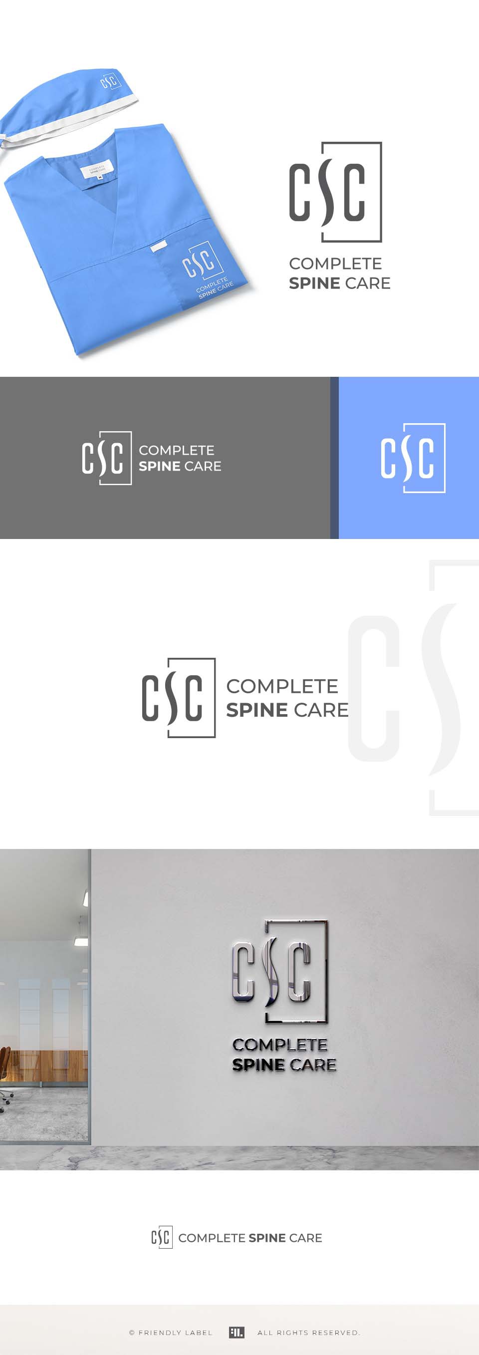
A modern, minimalist and smart logo for a great spine surgeon.
The "S" ( with a shape that reference a spine) is the visual focus of the icon, not the Cs. Although all the 3 letters are important in the visual economy, the S is slightly emphasized due to its shape and the rectangular framing.
The messages that the logo sends out are: professional, top expertise, trustworthy, serious, honest, exceptional, straight-forward, transparent.
The 2 brand colors that I featured here is a serious, but soft and elegant gray and a calming, relaxing light blue.
The typography is a modern, minimal and clean sans serif that has a perfect compatibility with the sophisticated simplicity of the icon.