Logo concept for Healthy Ice Cream

1
Created on 99designs by Vista
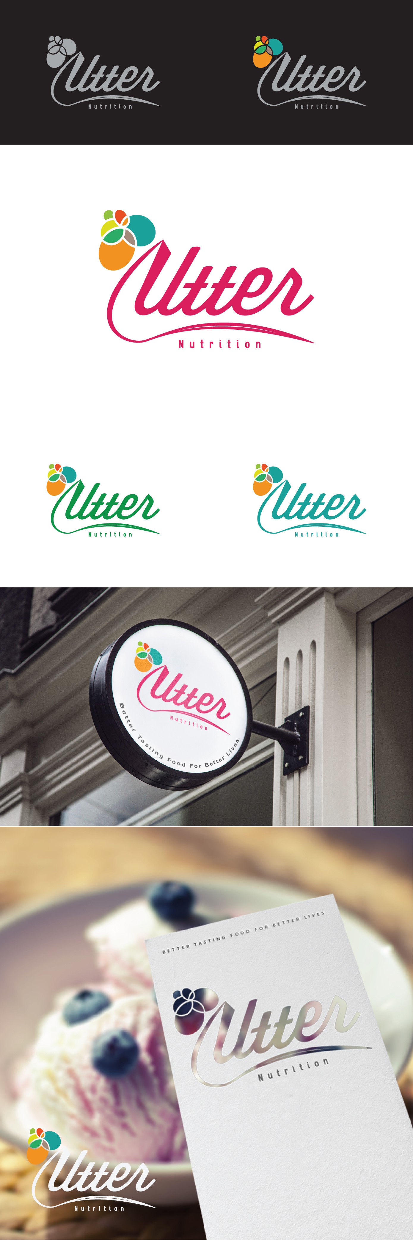
Finalist. The idea is to create an elegance, clean logo which appeal to the target market as outlined in the brief which is elderly/matured adult. The design idea is to use the text as the logo itself to give it identity as oppose to having a generic symbol. The addition of the sweeping line in the beginning of the text is to symbolize some sort of a cone or cup which hold the colorful ice cream on top.