Create a cool tech company logo featuring diverse faces!

46
Created on 99designs by Vista
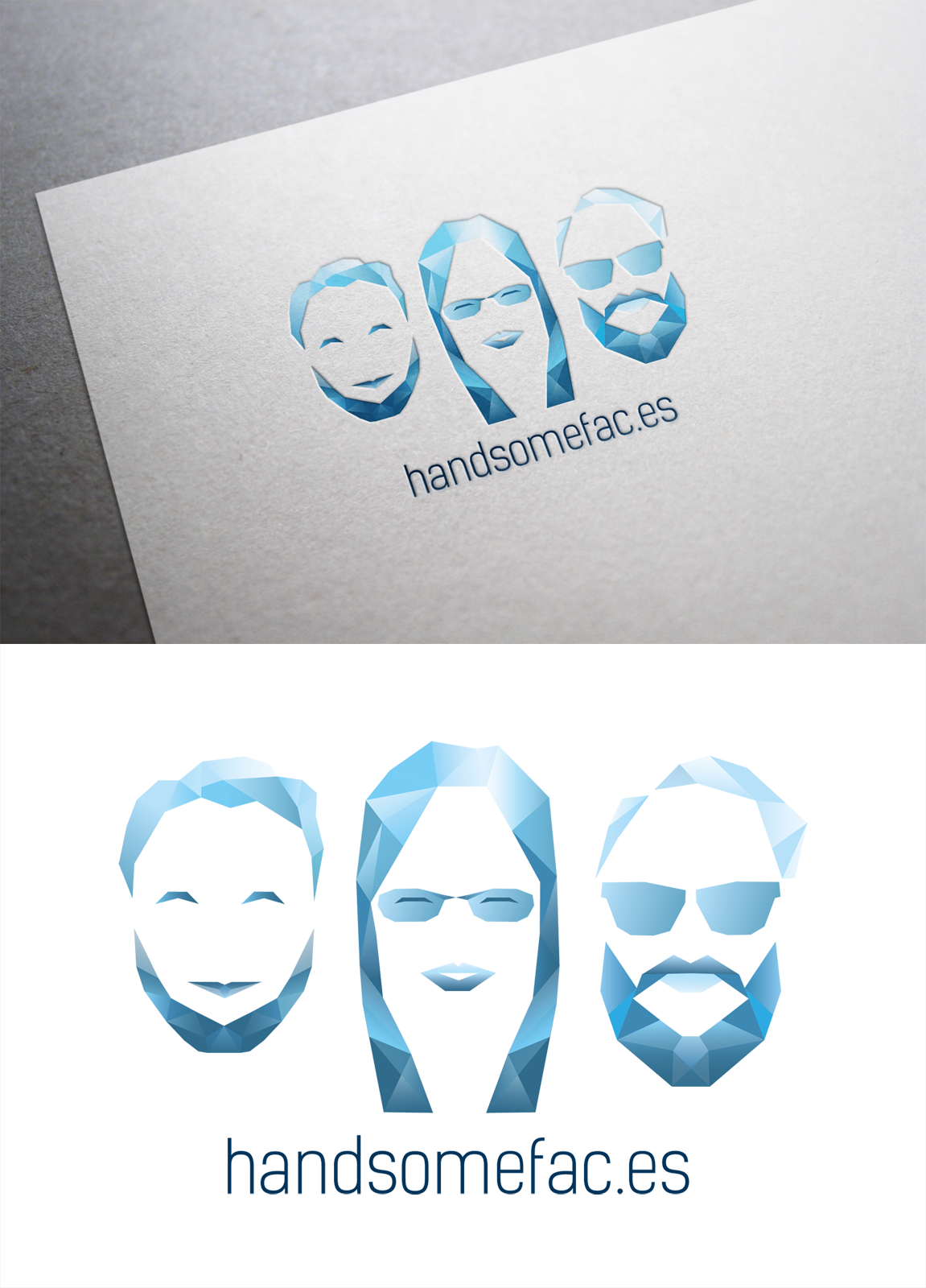
First the polygons were really big and had no gradients. The left one looked really creepy like the halloween mask. Then i added gradients and let the left one smile. Then I changed the colors so that the color from top to bottom are getting darker. At the end its a really unique and recognizable logo for a amazing little software company.