Create an Elegant yet Captivating logo for Jackpot Candles

13
Created on 99designs by Vista
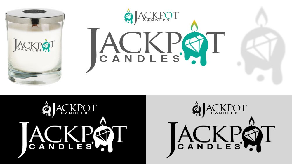
The contest holder was looking for a logo that clearly depicted the unusual concept of their product - a piece of jewelry hidden inside a candle. The name "Jackpot" is in a classy font to represent the high quality of the candle, the jewelry, and to appeal to their audience. The "O" in Jackpot was the perfect spot to add an abstract illustration of a candle with a big old diamond in it. The illustration paired with the company name conveys the idea that there is a prize with the candle.