
Created on 99designs by Vista
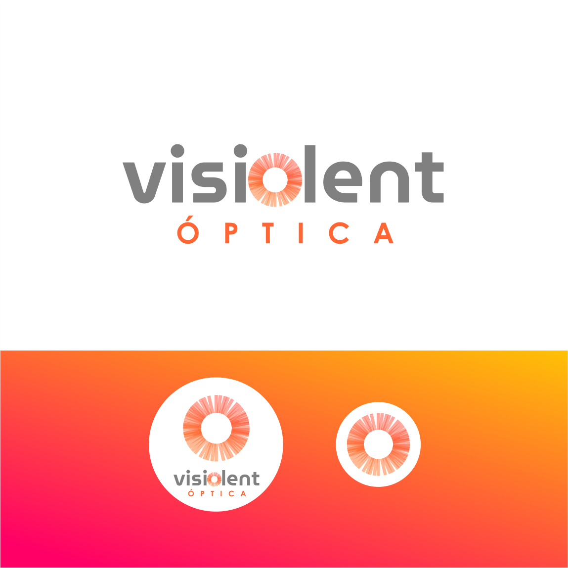
Visiolent, is an optical clinic that sought to redesign its brand. We created a completely new and innovative symbol. We include within the logo, in the letter "o", the shape of a retina, with its transparencies, with which, the turn of the business is evoked in a very direct way, and the approach of specialists in the area of ophthalmology. Iconically, the retina becomes the center of the brand's visual identity in all its supports. From an exterior banner, to the button of an app for the approach of customers.