Flat logo concept for digital agency

4
Created on 99designs by Vista
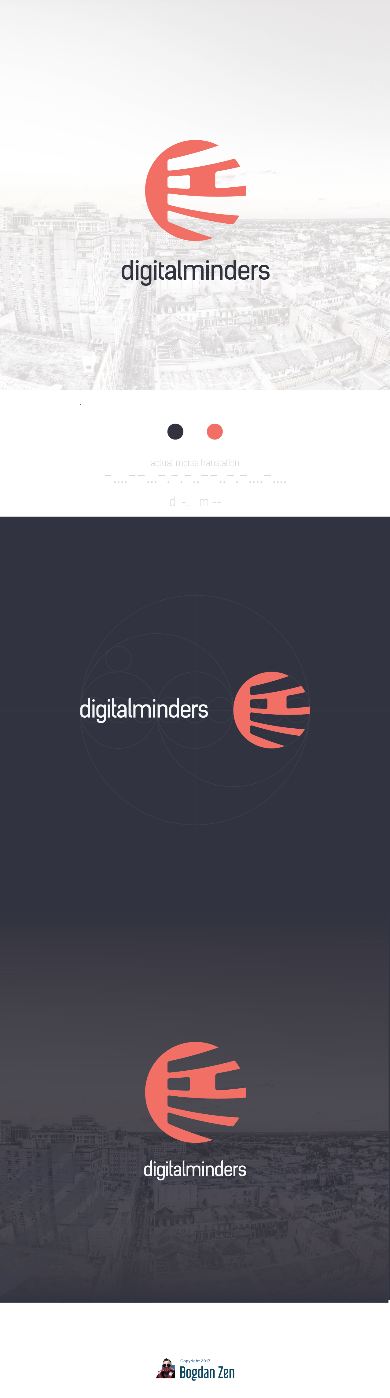
The icon is very simple built but really well thought. It is a monogram on D and M in morse code, thing I found tech-savvy enough to be the symbol of a digital agency yet simple enough to be comprehended easily by anyone.