
Created on 99designs by Vista
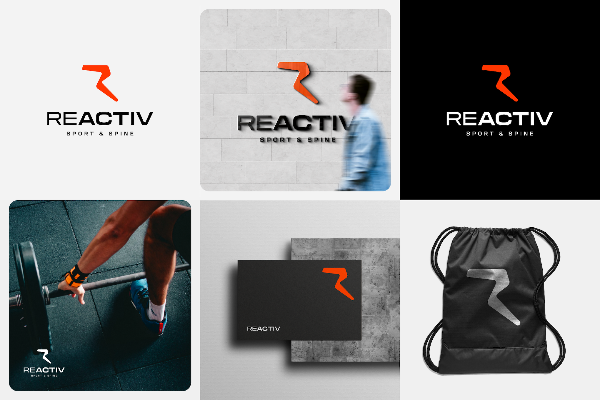
The simple, strong yet attachable identity is the mark for Reactiv. The mark was inspired by the bone/spine that formed the letter "R" as Reactiv. The logo was originally constructed to represent what Reactive did in their business activities as sports chiropractic clinic.