Dammit Jim! I'm a watchmaker not a designer!
1
Created on 99designs by Vista
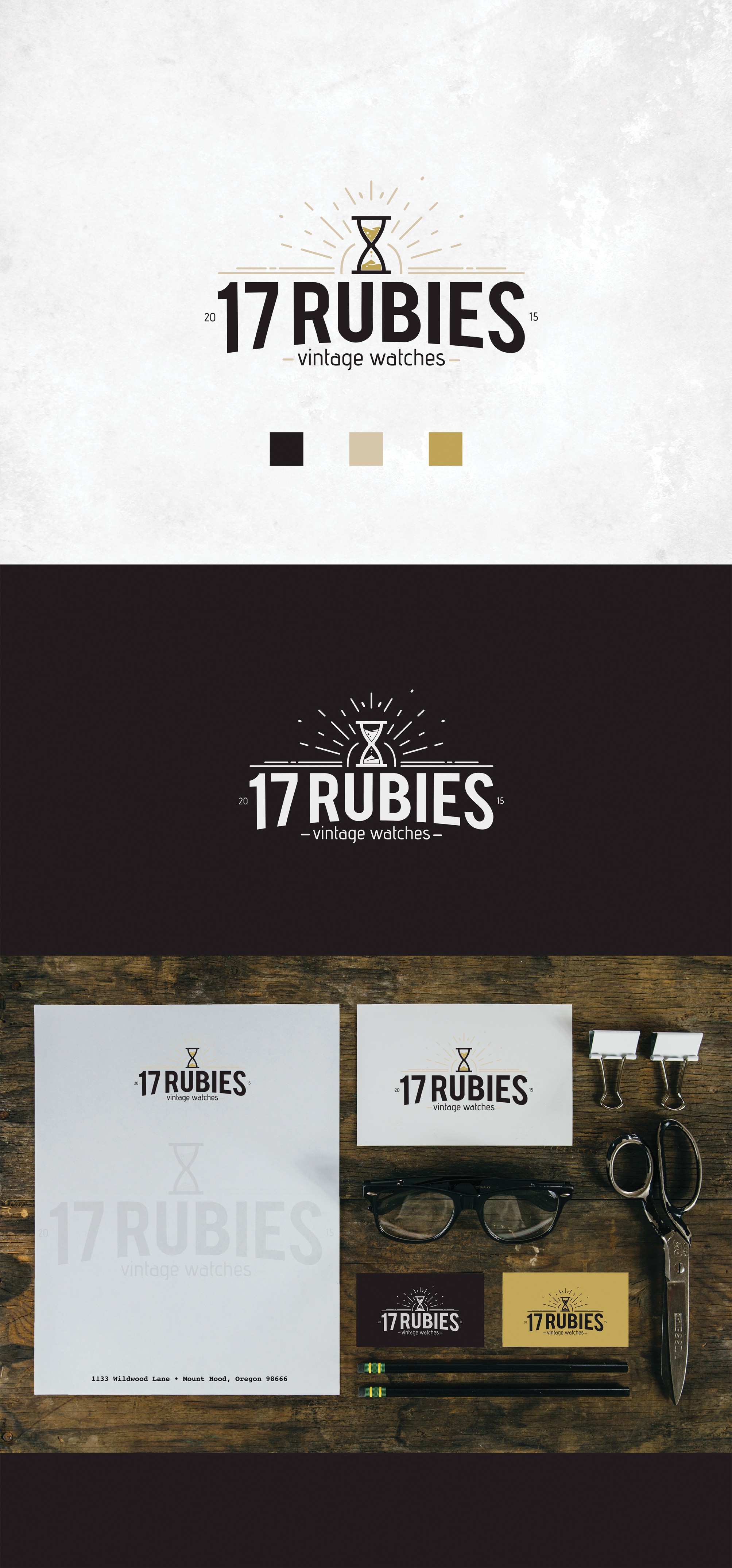
This design is an evolution of the previous idea. I went with the hourglass, because the logo is for a vintage watches website. I added to the vintage feeling with the rays in the background. As fro the color- I settled on it after the client responded well to the color scheme. Red didn't work well for him. Unfrotunatley for me, the design didn't win the contest.
