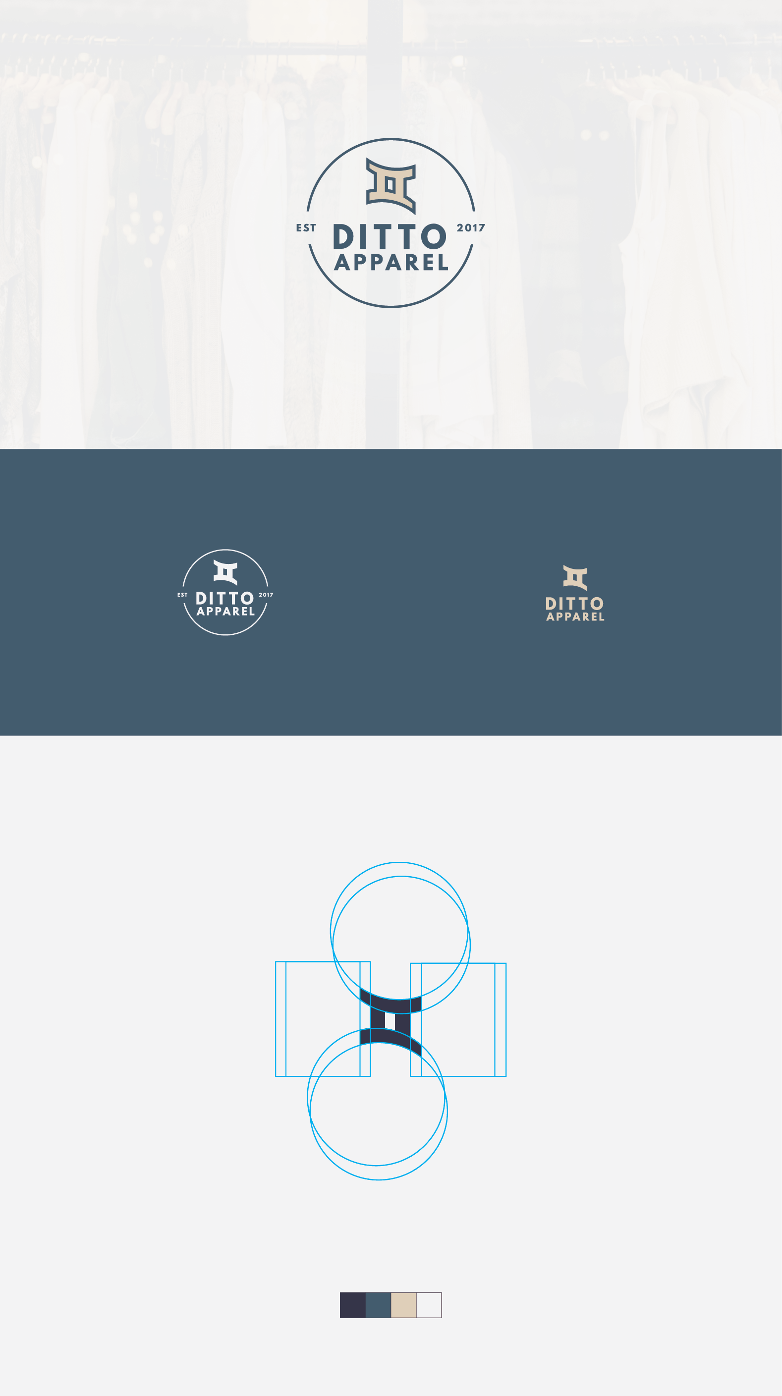
The main icon in this logo was a play on the word "ditto," which can mean to duplicate or double. The lines are also curved to communicate movement and fluidity.