2-Page Spread Ad Campaign for Bicycling Org

0
Created on 99designs by Vista
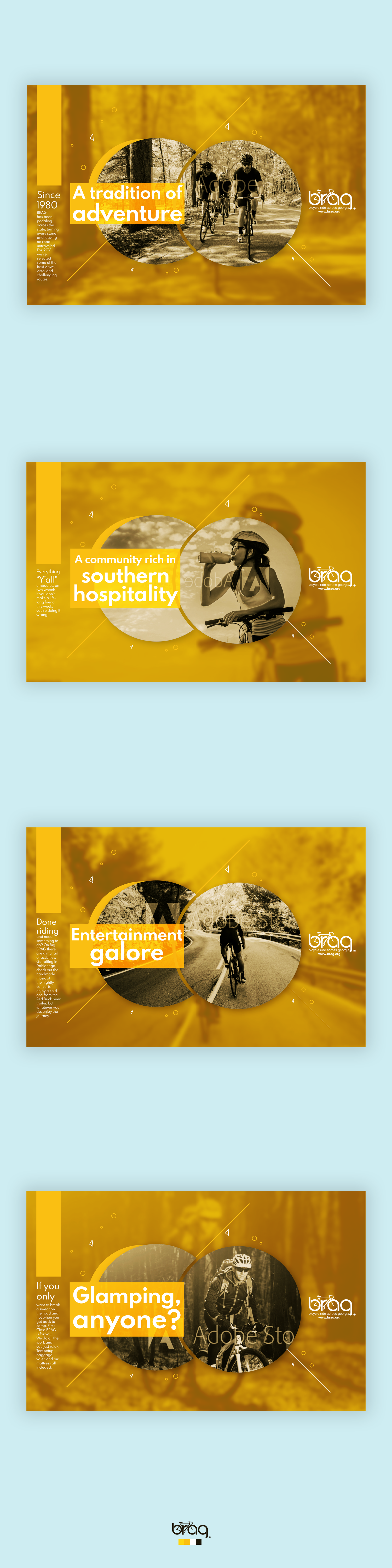
In these campaign ads, I used circular shapes to form a central graphic that would draw readers in. The shapes are circular to represent bicycle tires, and the lines behind them guide the reader throughout the spread. The lines also communicate a sense of motion and journey.
The color palette was inspired from the company's logo files. I liked the yellow because it gave a feeling of energy/warmth and contrasted nicely with the desaturated photos for balance.
These magazine ads were given a typographic treatment that would make it easy to input many different messages while still adhering to the brand.