Database of Intellectual Property - Web Design

15
Created on 99designs by Vista
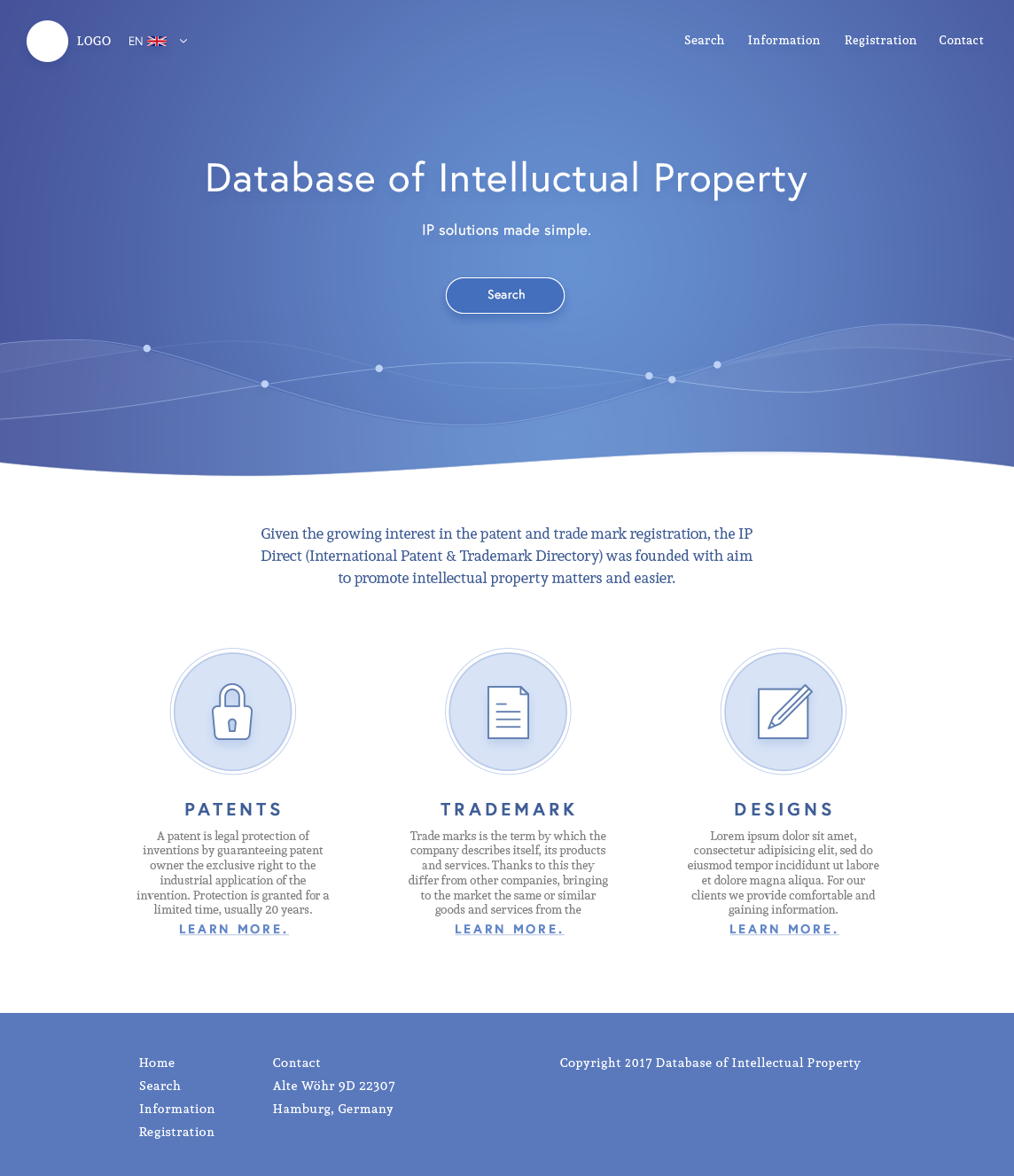
The client was looking for something professional, easy to use, and "calm". The blue tone, along with the friendly and clean graphics and type balances these aspects.
The large amount of whitespace allows for clear and easy reading, and ultimately assists in providing a great user experience.