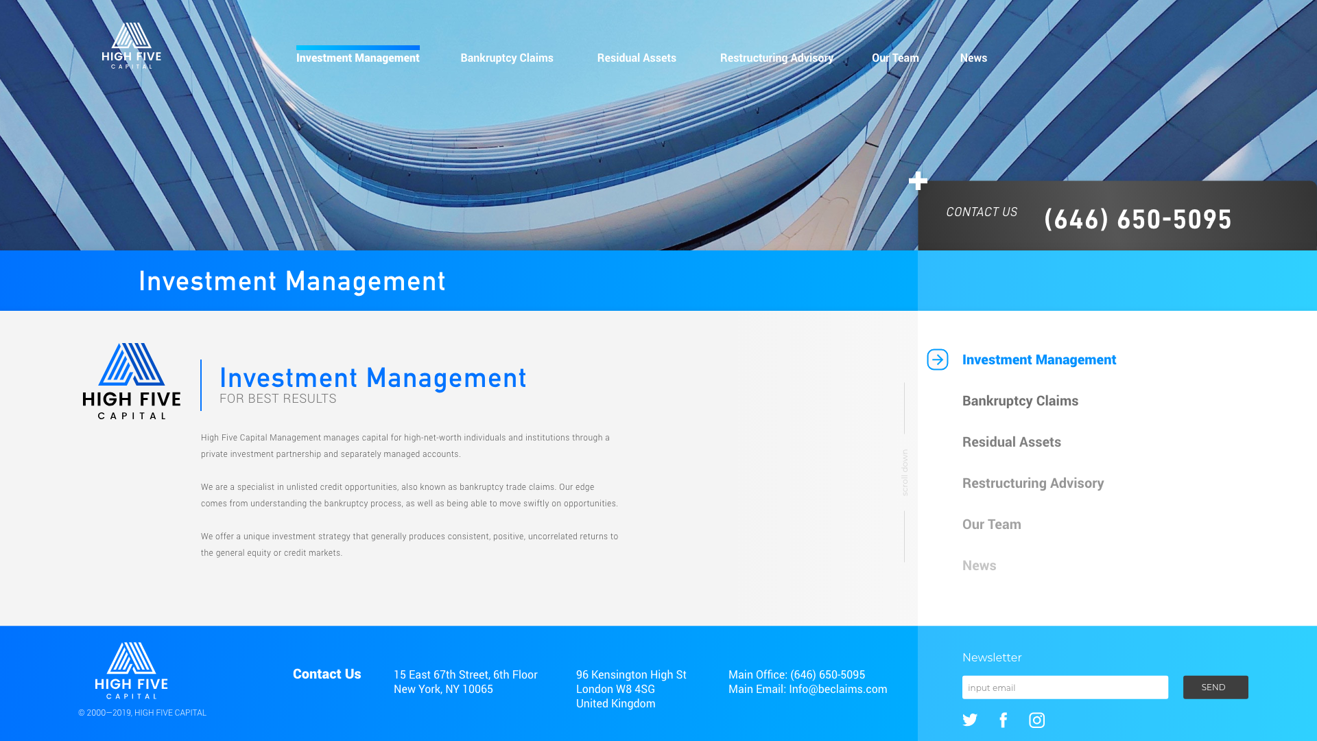
Minimalistic Webdesign for Investment Company

0
Created on 99designs by Vista
As there was only a small amount of content on the existing page of the contestholder, I created this simple but focused design.
It was mentioned to avoid scrolling and give the visitor a quick overview of the companys benefits for their clients.
The design seemed not to fit into the CH needs and I had not the possibility to improve the design because of the lack of feedback on the contest.
Maybe this will fit better in what you aim for your website.
Would work fine as a Landingpage concept with a prominent CTA and the modular layout that can be used for different kinds of content.
Let me know what you think about this design.
Thank You
Alex