
Cafe Botero is a family business with more than 100 years in the coffee business.
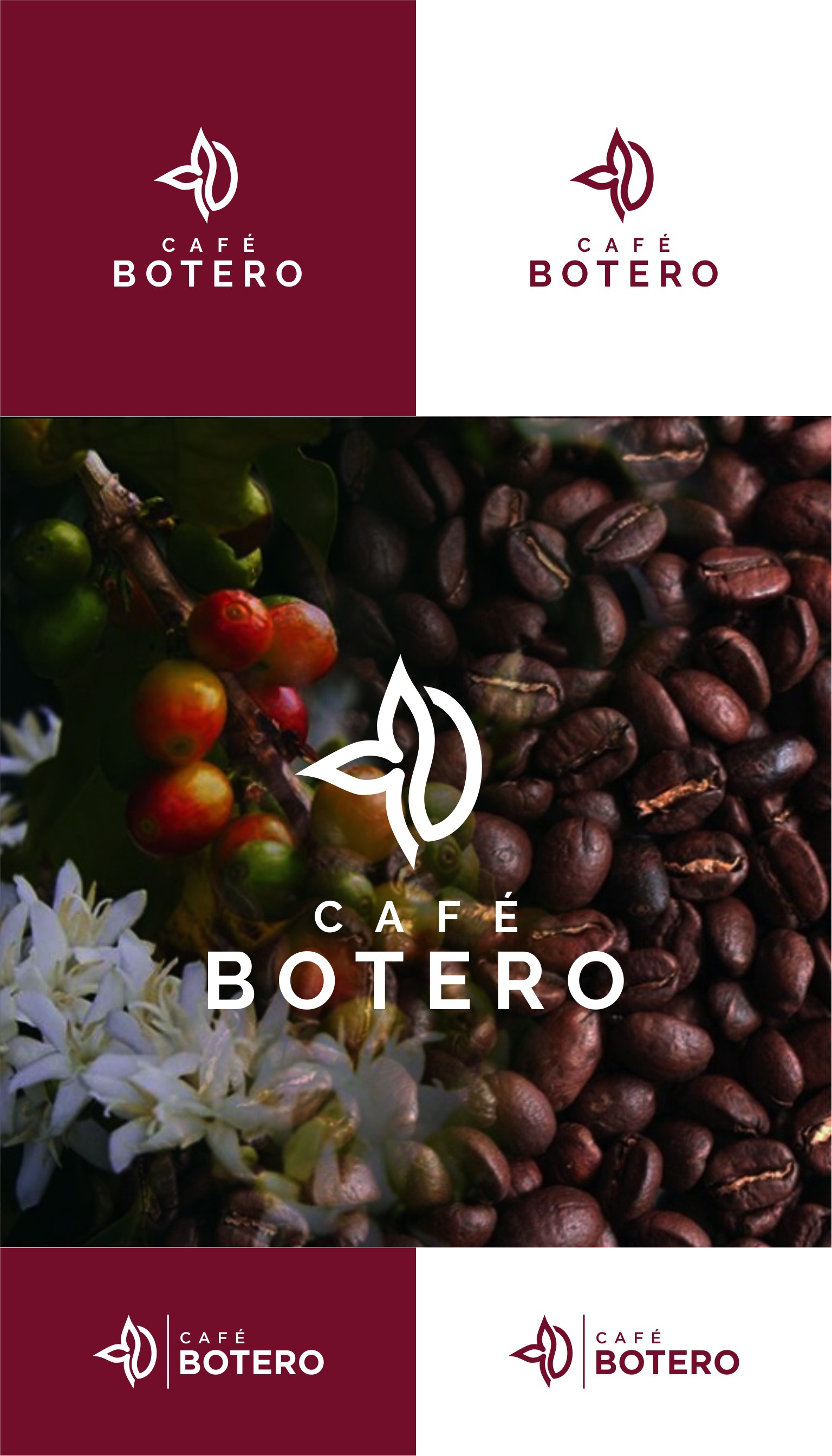
The client hired me to re-design their old logo (which was a coffee flower with a coffee bean in the middle). They wanted something cleaner, lighter and modern while keeping the identity of the brand.
So I had the idea of a half of a coffee flower and a half of a coffee bean made by a single line. The role of the monoline is to make the logo clever of course, but the main role is to suggest that there is only one entity that makes the whole activity. From the cultivation and harvesting (represented by the flower) to processing and selling (represented by the coffee bean - the final product). An entity which is CafeBotero.
Simple but meaningful, minimalist and clean.