Candex. Logo for a payment product

74
Created on 99designs by Vista
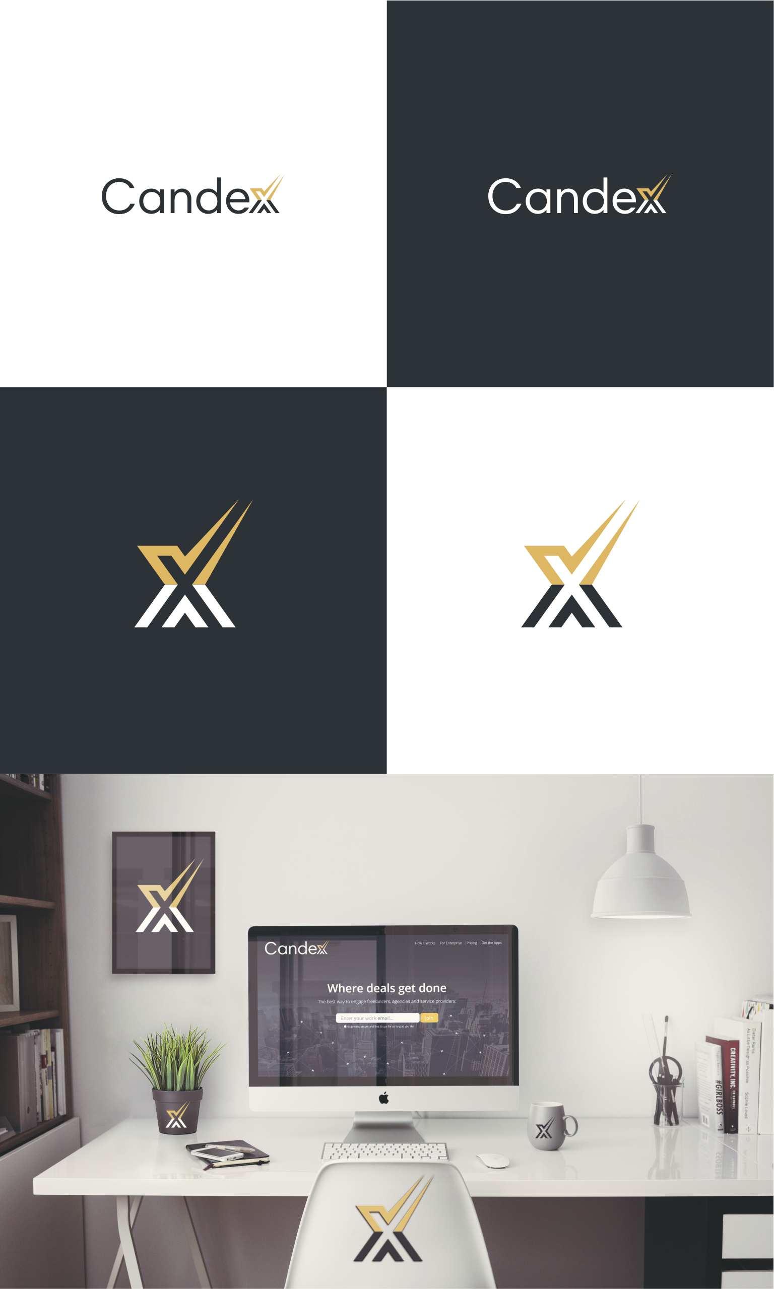
Candex is a company that provide apps in which large companies can collaborate with smaller service providers, most especially handling invoicing, approval and payment much more efficiently and with fewer errors. The client wanted a redesign of their old logo thas was focused on the letter X.
Letter X because their software acts as an eXchange in which payment for services happens. That being said, my design kept the focus on X, but in a modern way and introducing a new accent: the checkmark. I chose this symbol because fits perfect and gives a meaning about the quality services that Candex offers.Also the checkmark is about safe, approval, trustfull, etc.