Logo design proposal for Master Bore

0
Created on 99designs by Vista
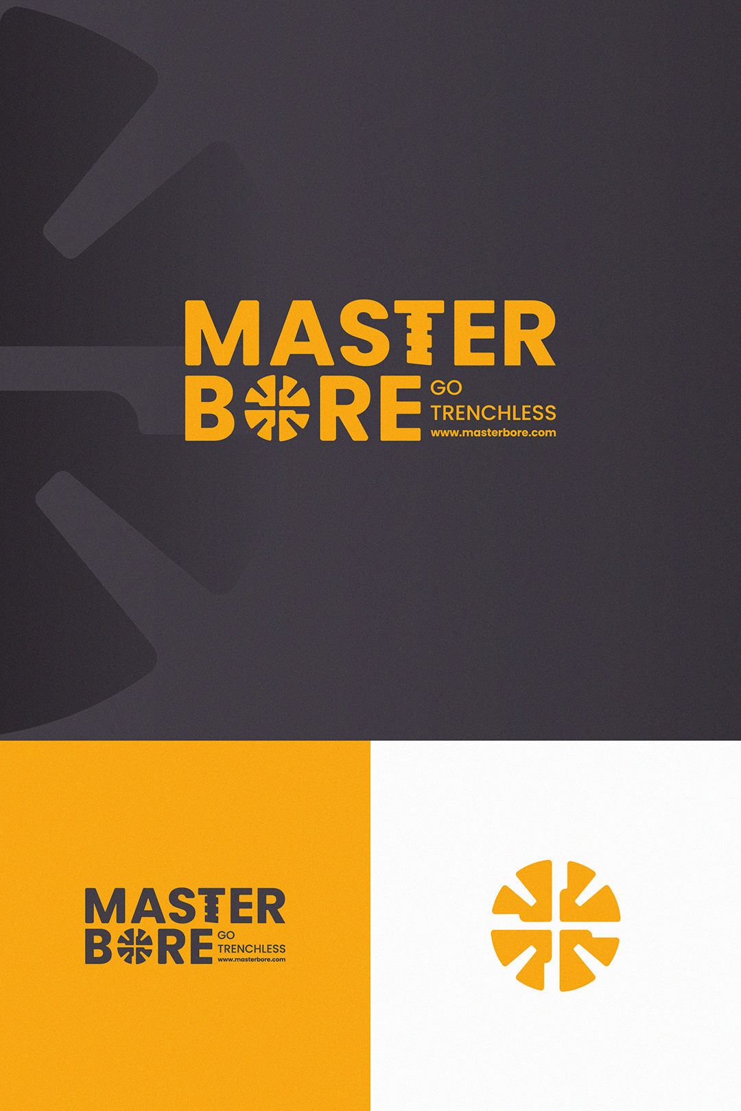
I developed a new logo proposal, incorporating elements from the client's current logo. I chose a sans-serif font to give the brand a more solid and modern feel, aligning all elements to the left. The pipe drill illustration was transformed into a front-facing icon, and I added a drill detail to the 'T' to reinforce the concept.
To ensure a smooth transition, I retained the client's existing color palette for consistency and familiarity.