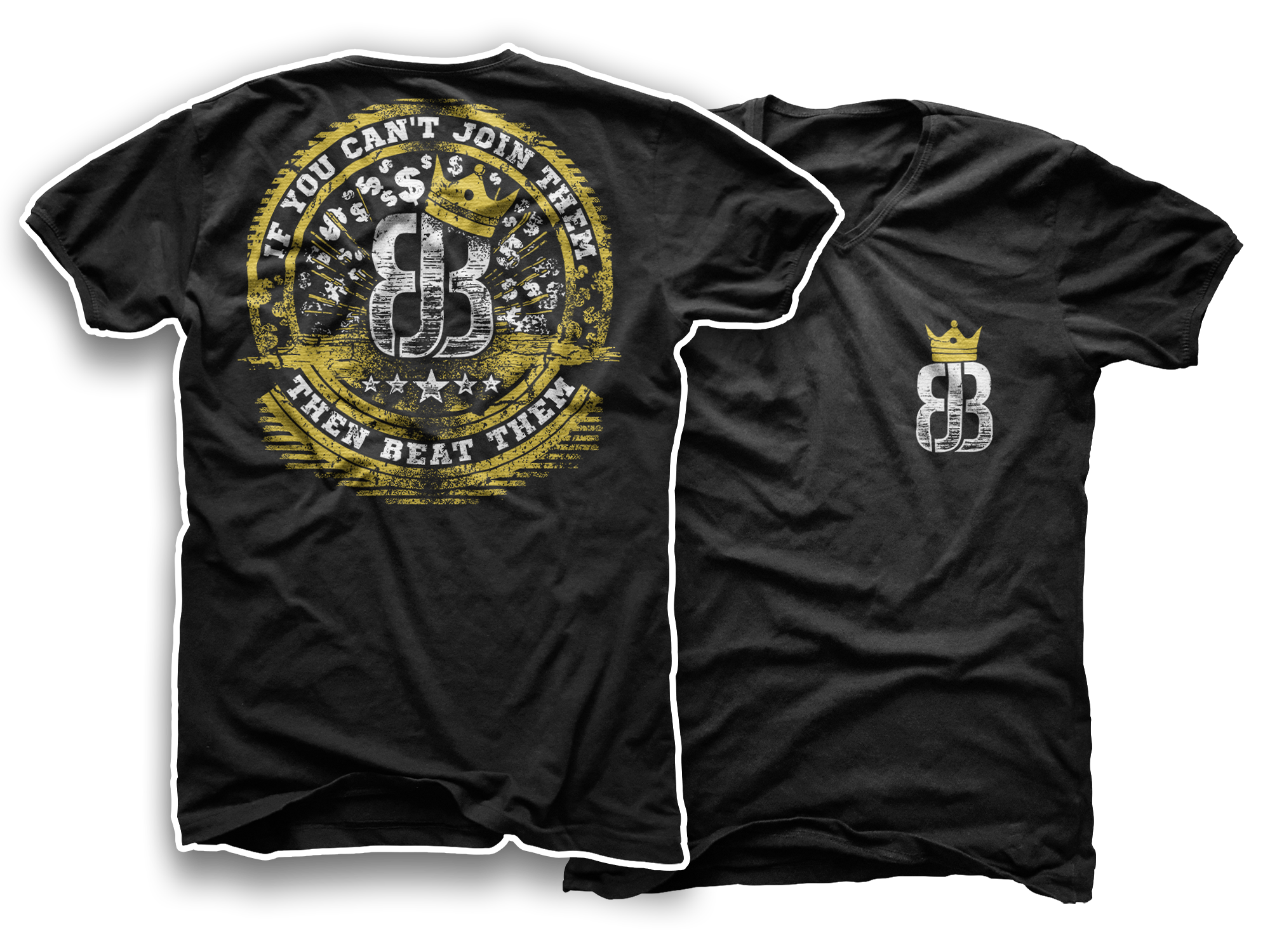
If you can't join them then beat them T-shirt
23
Created on 99designs by Vista
This design had to be all about money, wealth, gold, fame and glory. What the contest holder liked the most in my entry was the tilted crown on their logo - it gives a slight note of asymmetry which can be good in such straightforward designs.
