Logo Concept for a Innovation Startup

3
Created on 99designs by Vista
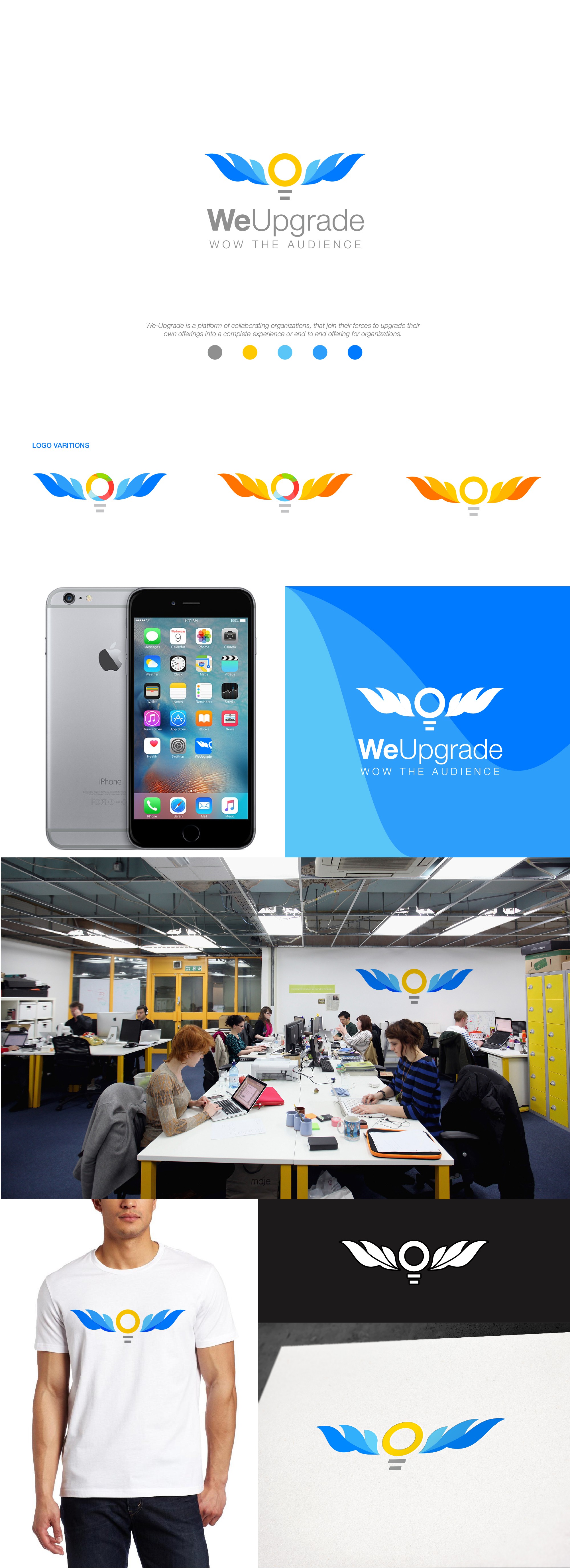
The design is an abstract combination of wings and bulb.
The bulb is an idea/innovation that a startup brings to WeUpgrade.
WeUpgrade are the wings that help the innovation launch/takeoff from the ground to new heights. In context this means that they help a startup from an idea phase to prototype phase. WeUpgrade USP is wow! , they are attracted to a wow idea,they might have wow network or they might even create a wow product that disrupts the industry away,but the core theme is Wow. The logo subtly,creatively has the word WOW. The wings form alphabets W and the bulb form the letter O.
Ultimately the logo communicates what are WeUpgrade expects and what can a target audience expect from WeUpgrade.