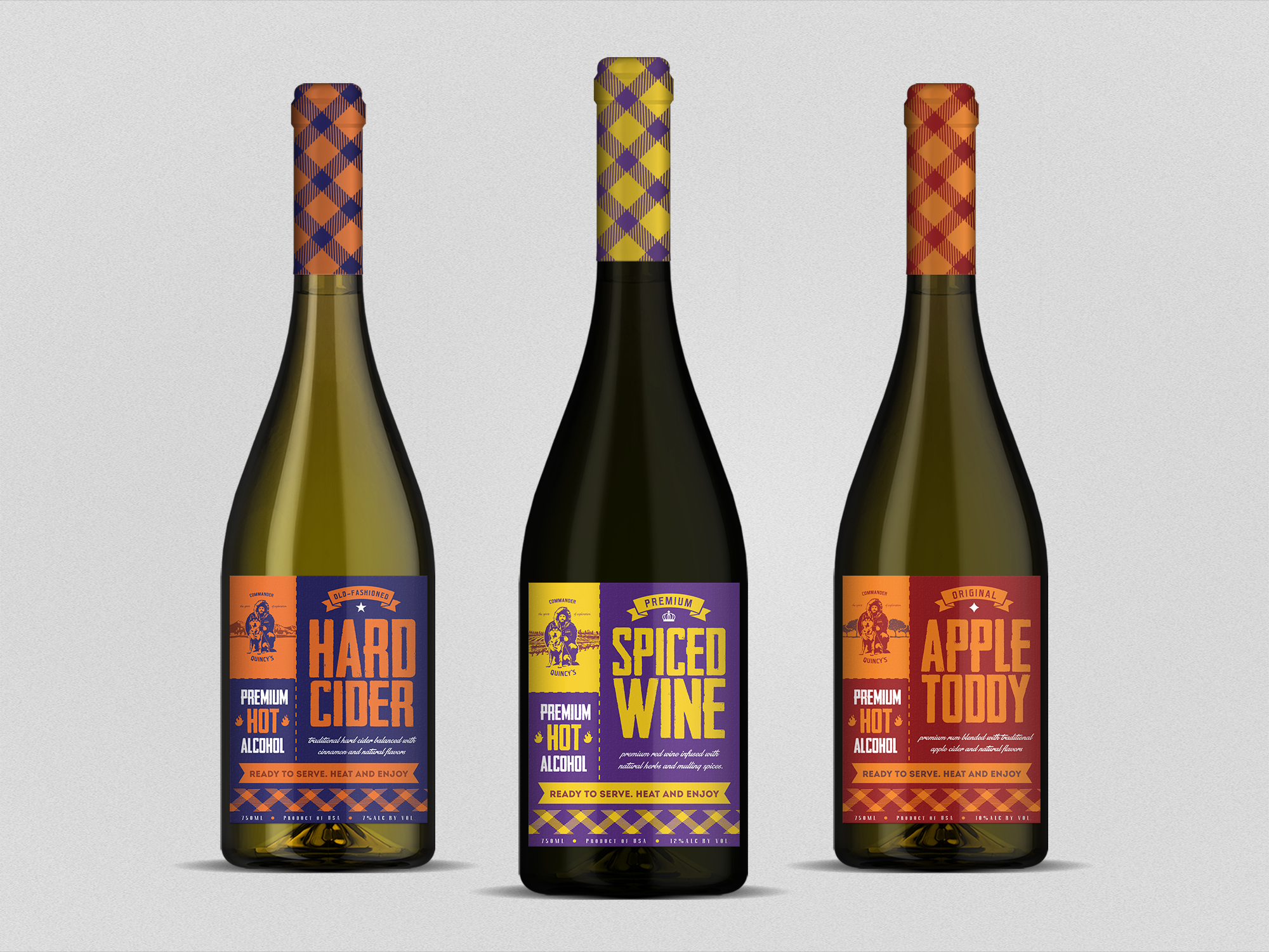
Wine Bottle Label for Commander Quincy's Spiced Wine

3
Created on 99designs by Vista
Thye wanted to communicate (through color, graphics, and wording) that they
are a hot alcoholic beverage. I came with same layout (differentiate via color), vintage look and bold typography for eye catching effect.