
Created on 99designs by Vista
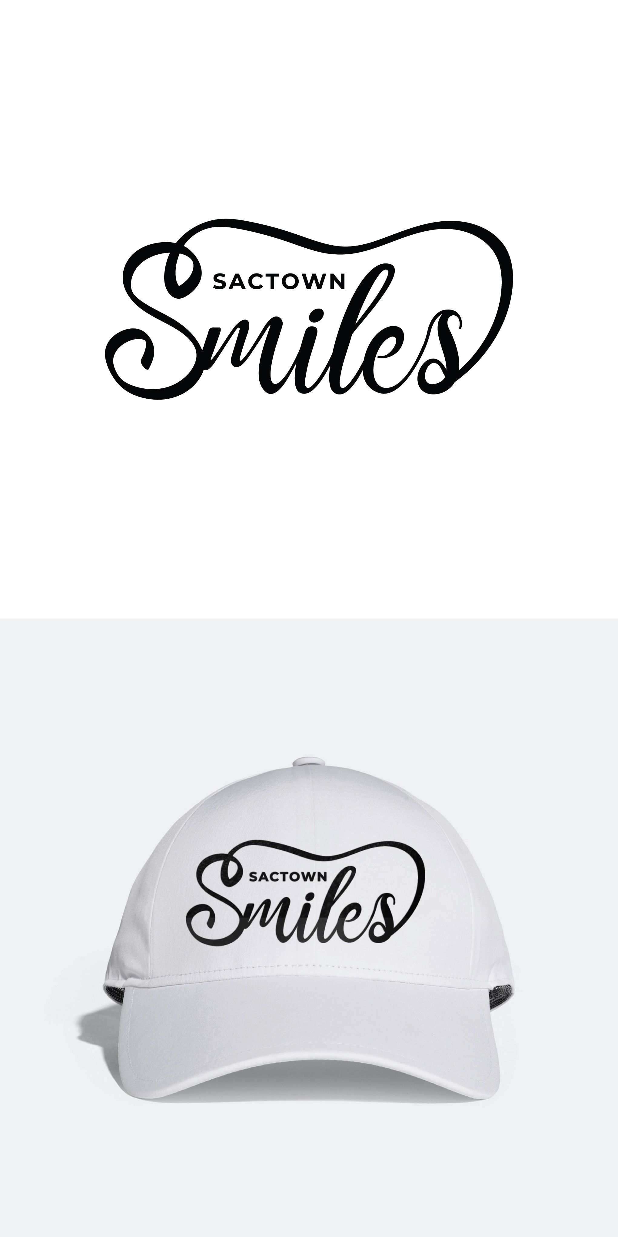
- Gave a little swirl just like 'Vice', however, there's a concept behind the swirl; since the business is into orthodontics, I've created an abstract tooth shapes swirl connecting the two letter S
- The word SACTOWN is also designed keeping in mind its size. Since its small and yet we need to make it look professional, I've kept a minor gap between all the letters in SACTOWN and also made it BOLD in weight
- Letter S is not the typical cursive but traditional handwritten as requested