Sleek and Modern logo design for roofing company

30
Created on 99designs by Vista
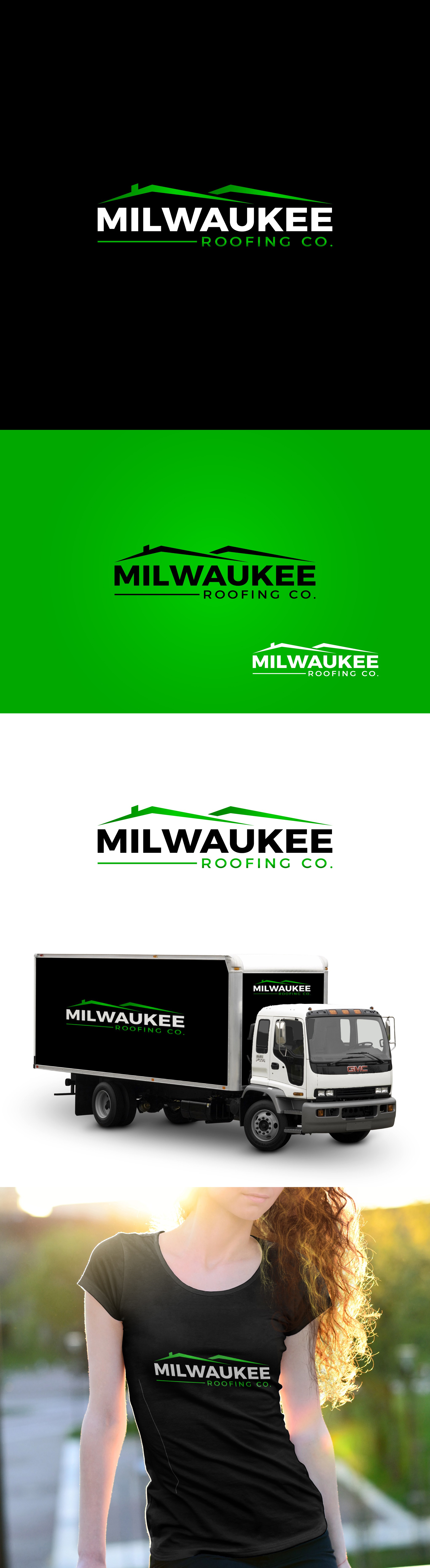
Considering the industry background and the requirement to give a luxurious touch, I quickly went through the sketching of different versions of roofs focusing particularly on the pointed/sleek ones.
After presenting few initial concepts and discussing with the client, we narrowed down to this one and continued playing with the font weights and colours.
It was crucial to mock up the logo on truck and tshirt to get the feel of logo put in production.
This typeface is modern and bold in weight since roofing company has to do a lot with trust, be it with audience or the materials used.
We concluded with this as final one after considering all background and colour options.