Hemp Gummies Packaging for Apotheca

1
Created on 99designs by Vista
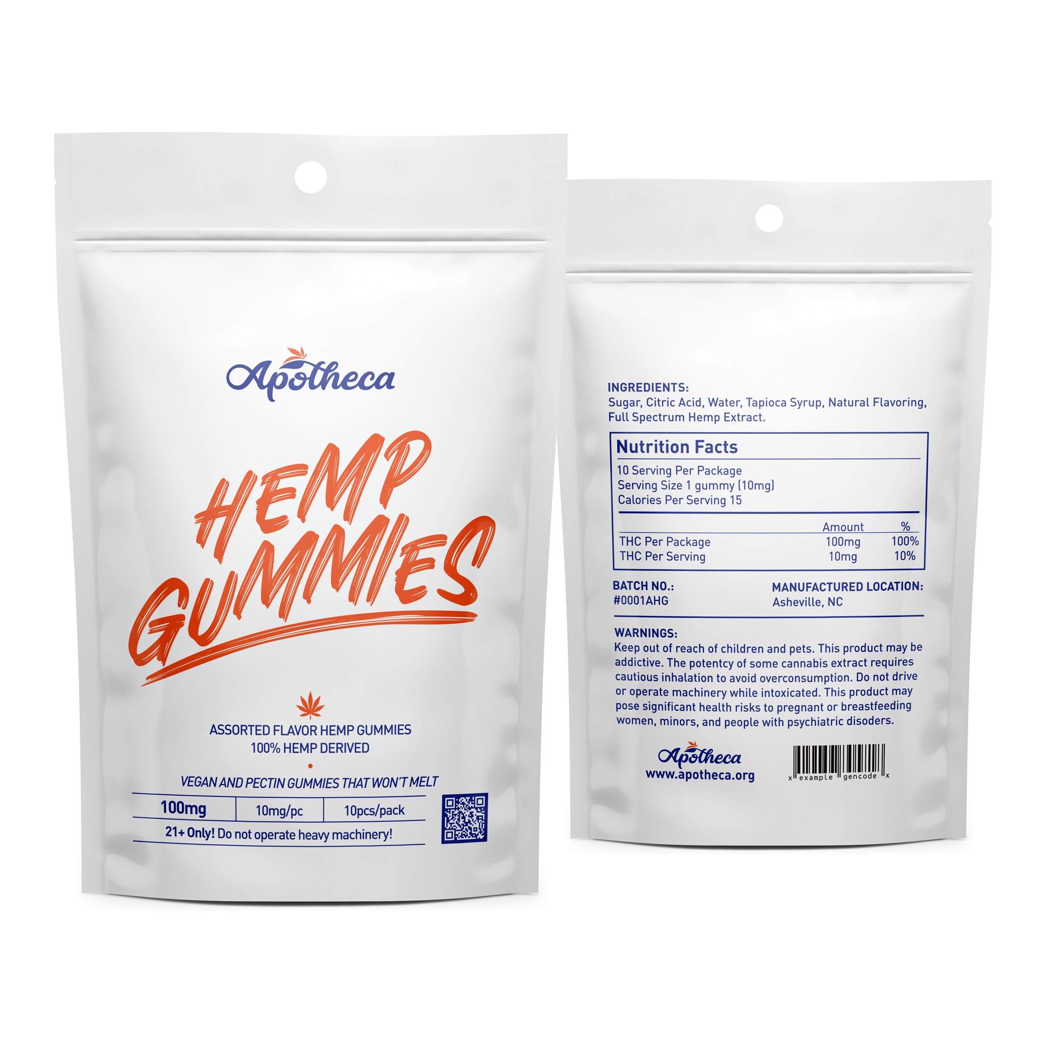
Submission for packaging design contest. The task is to create minimalist design concept that pop-out.
Since the packaging is hand palm size, we need something that bright and contrast to pop-out from the shelves. Hence, the orange colour is used to grab and catch the attention of viewer with "marker-styled" font in the middle. Contrasting with dark blue colour to other detail with some spot colour of orange to guide the viewer see things. Selecting the right fonts and using the right size is important because the packaging is small and we don't want to hurt the customer eyes with hard to read information.